©
-
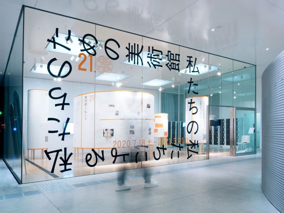
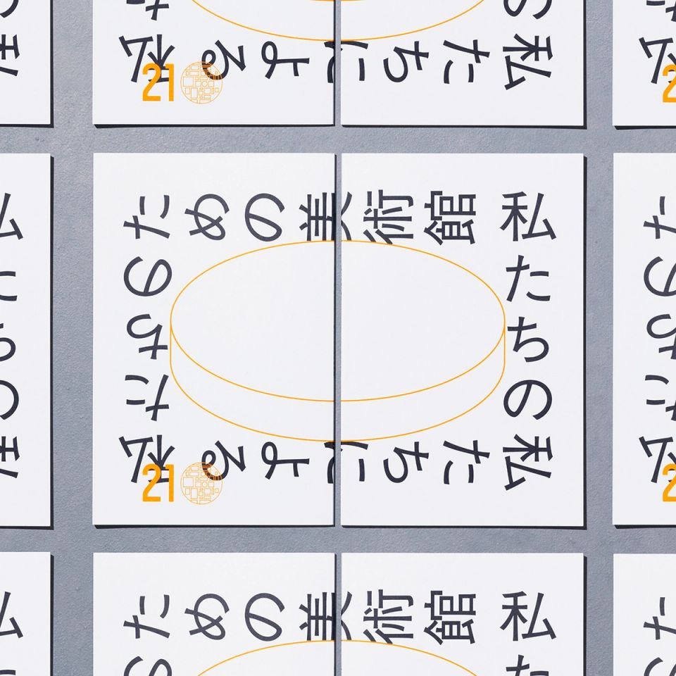
100th Anniversary of the Tokyo Metropolitan Art Museum
Tokyo Metropolitan Art Museum -
Blue Zones Holdings C.I.
BLUE ZONES HOLDINGS CO., LTD. -
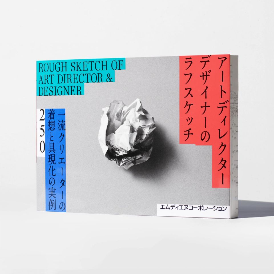
ROUGH SKETCH OF ART DIRECTOR & DESIGNER 250
MdN -
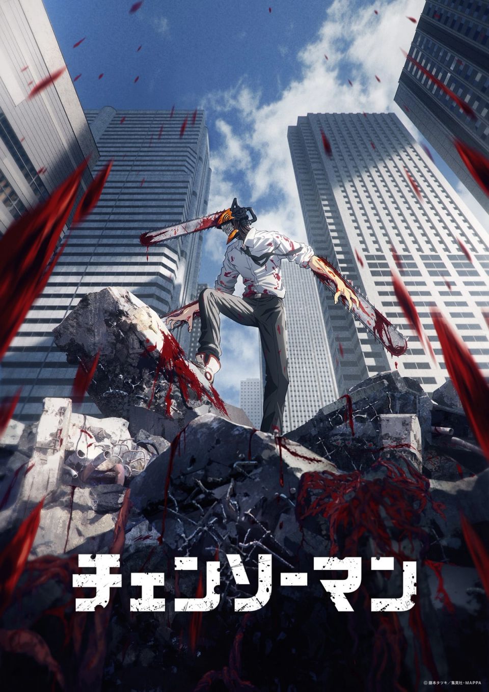
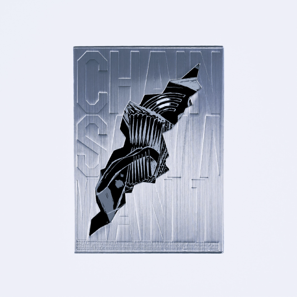
CHAINSAW MAN_THE MOVIE
MAPPA -
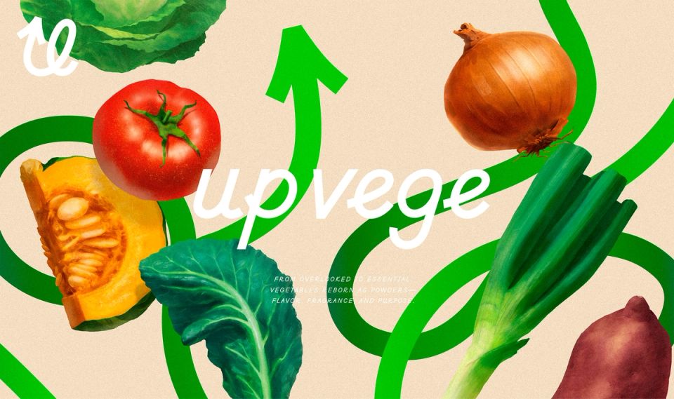
up vege
Greenase -
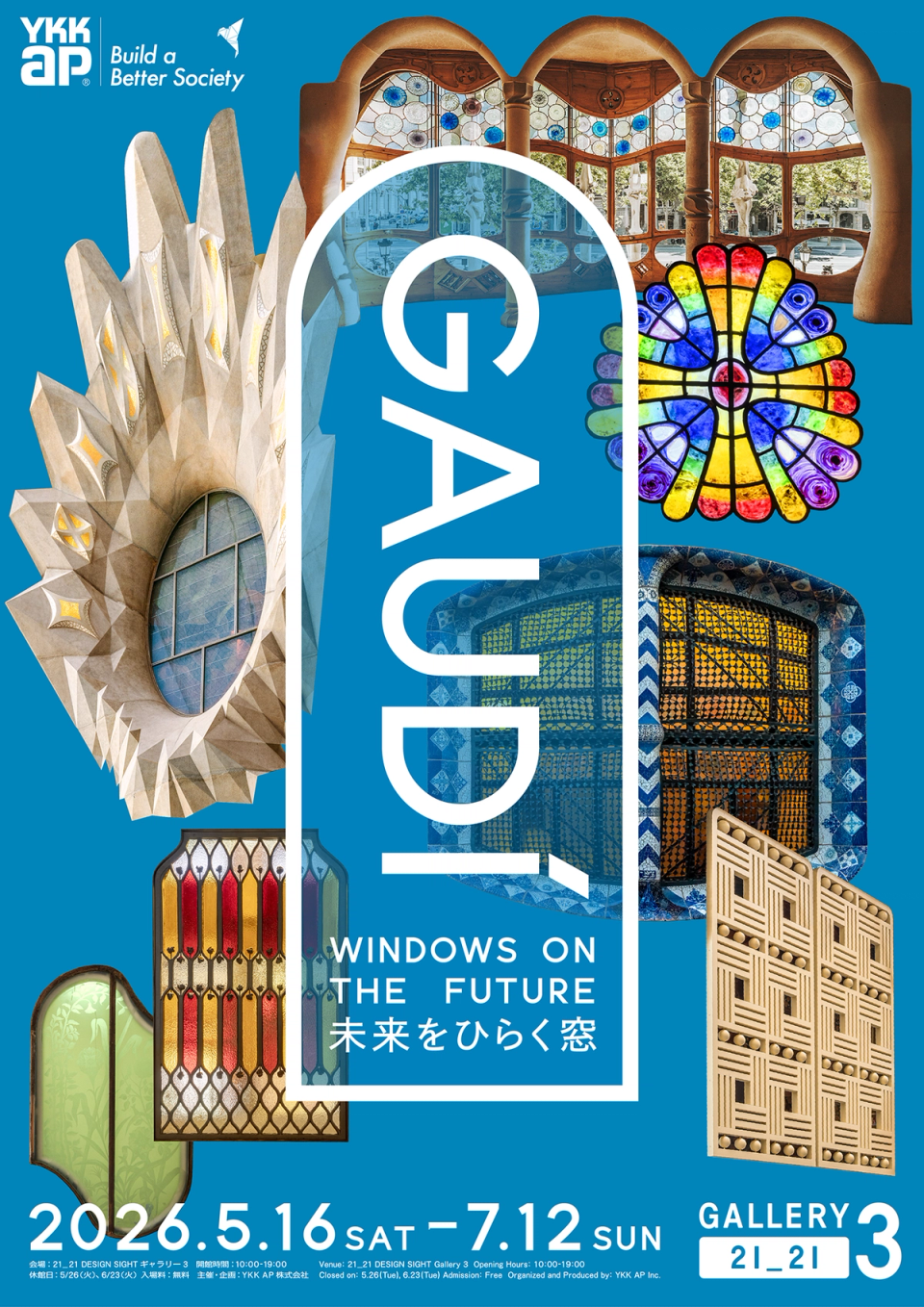
WINDOW ON THE FUTURE
YKK AP Inc. -
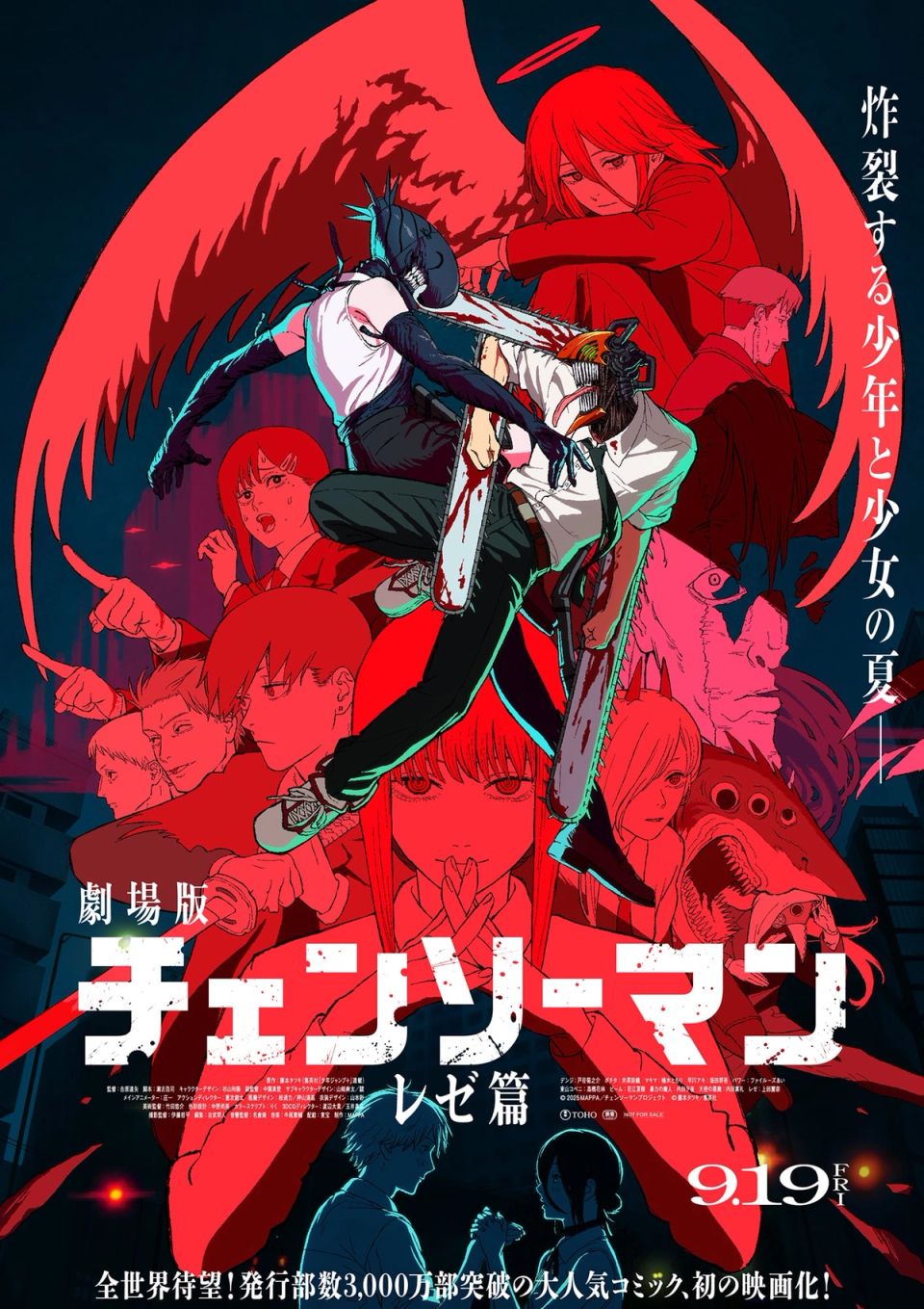
CHAINSAW MAN_THE MOVIE
MAPPA -
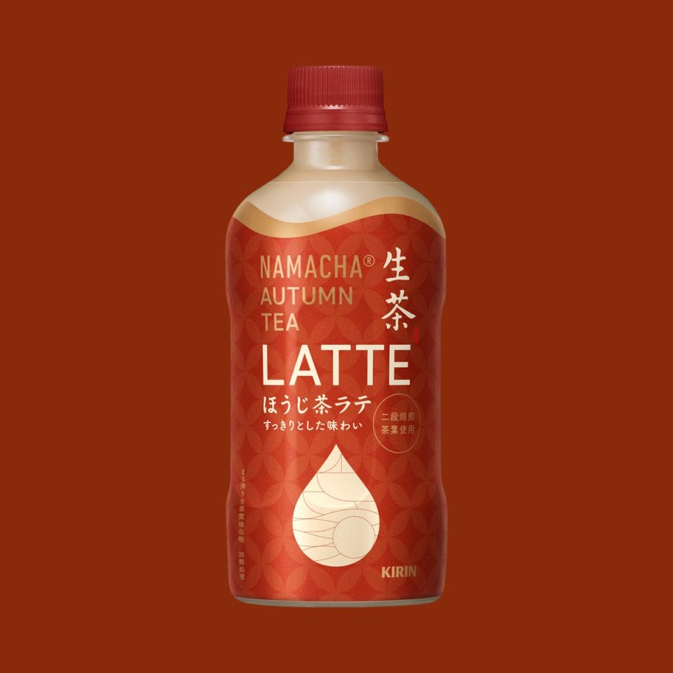
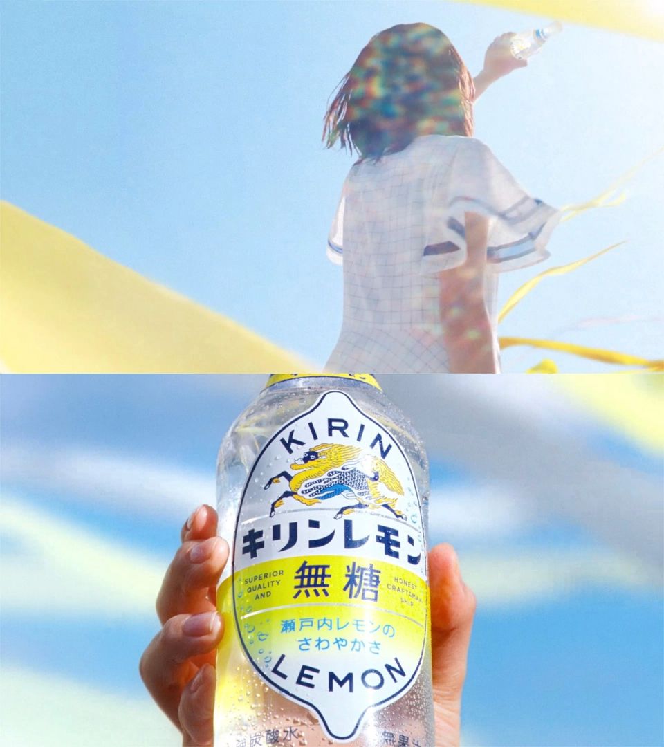
KIRIN NAMACHA®️ Hoji Latte
Kirin beverage -
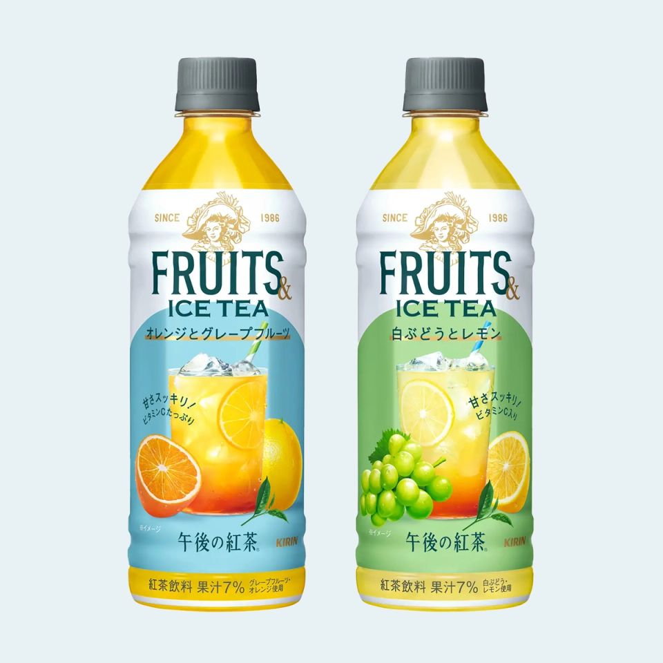
KIRIN FRUITS&TEA
Kirin beverage -
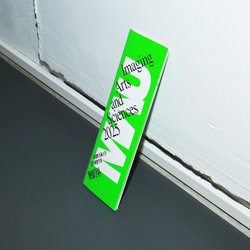
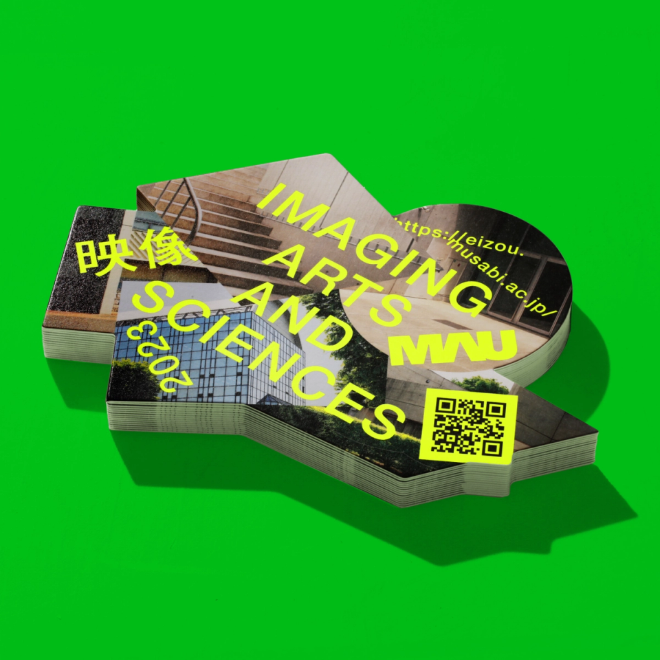
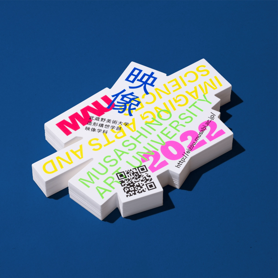
Musashino Art University IAS 2025
Musashino Art University -
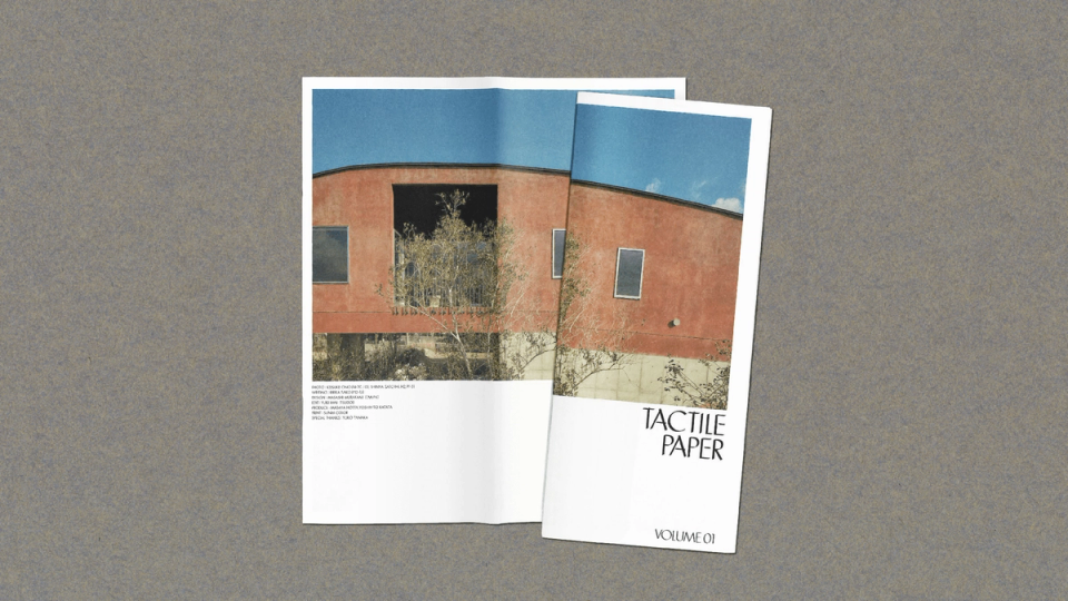
TACTILE
Tactile Material Co.,Ltd. -
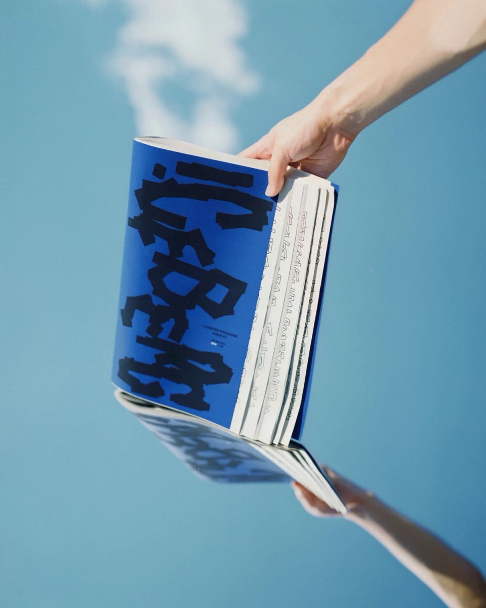
I.CEBERG MAGAZINE 01
WOW -
Mitsubishi UFJ Trust and Banking Branding
Mitsubishi UFJ Trust and Banking -
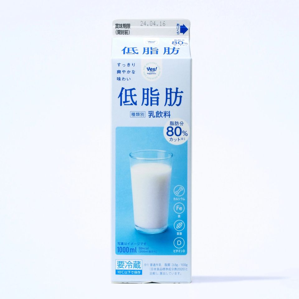
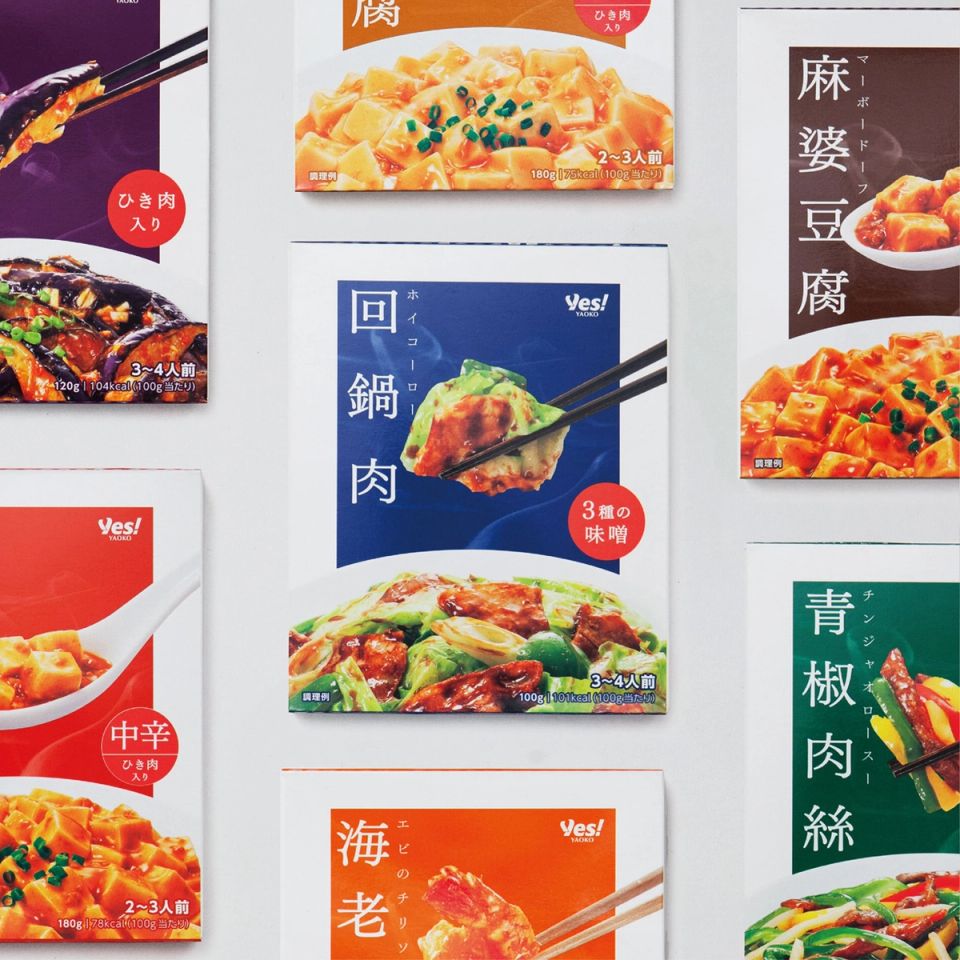
Yaoko PB 2025
YAOKO -

Itabashi Art Museum Exhibition
Itabashi Art Museum -
TACTILE
Tactile Material Co.,Ltd. -
I.CEBERG
WOW -
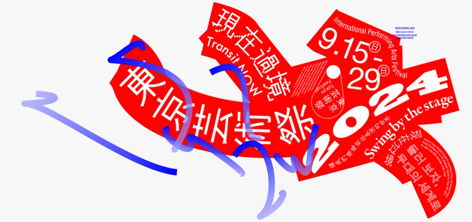
Tokyo Festival 2024
Tokyo Festival Executive Office -
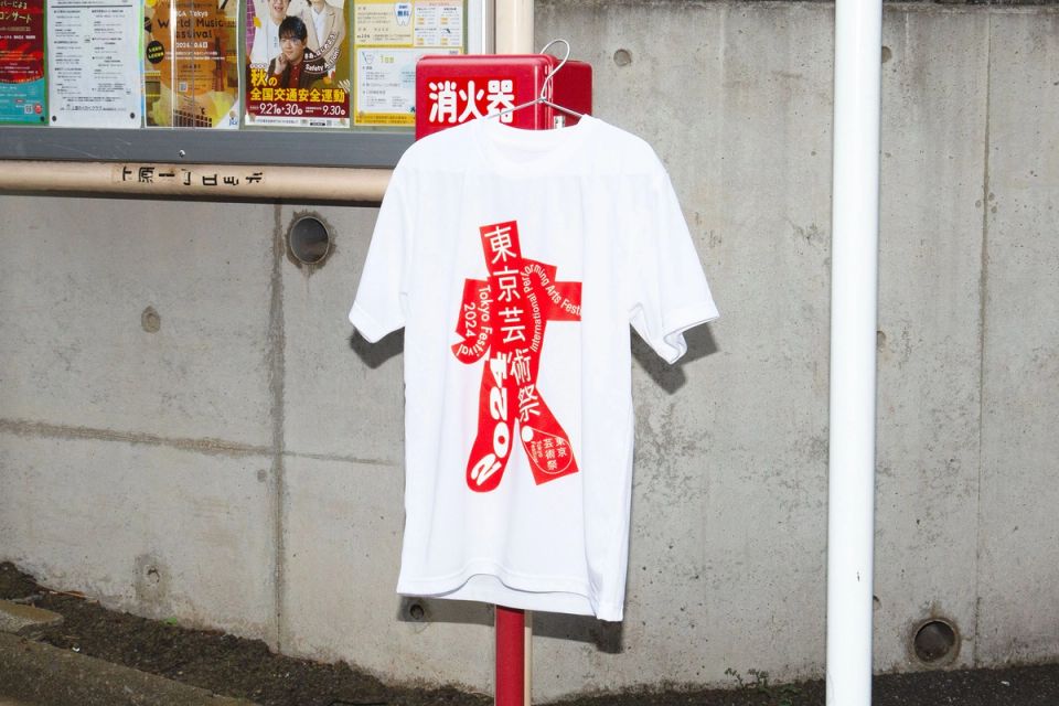
Tokyo Festival 2024 tool
Tokyo Festival Executive Office -
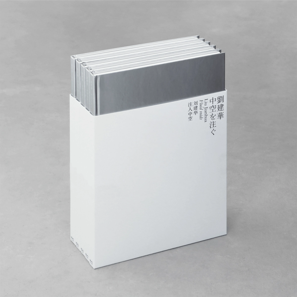
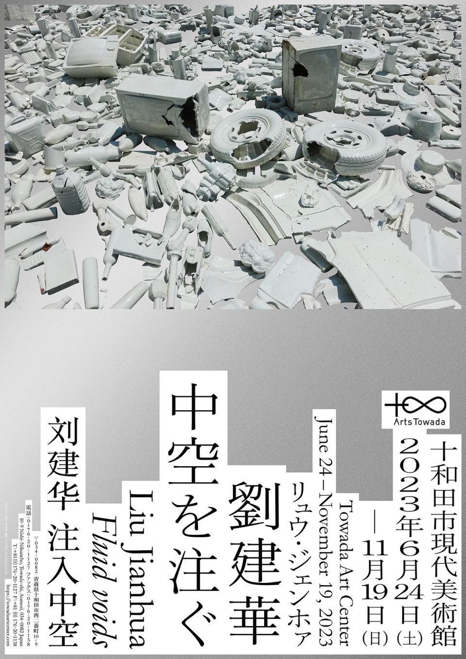
Liu Jianhua Fluid voids Catalog
Towada Art Center -
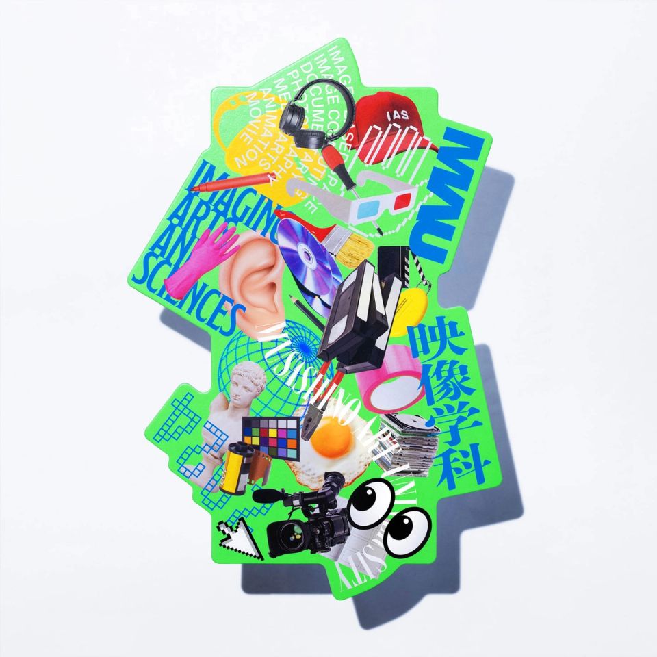
Musashino Art University IAS 2024
Musashino Art University -
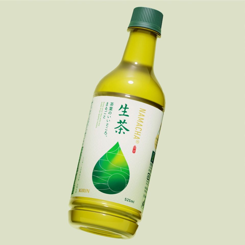
KIRIN NAMACHA®️
Kirin beverage -
CHAINSAW MAN
MAPPA -
Museum of the people, by the people, for the people / Space
21st Century Museum of Contemporary Art, Kanazawa -
Museum of the people, by the people, for the people / Catalog
21st Century Museum of Contemporary Art, Kanazawa -
Museum of the people, by the people, for the people
21st Century Museum of Contemporary Art, Kanazawa -
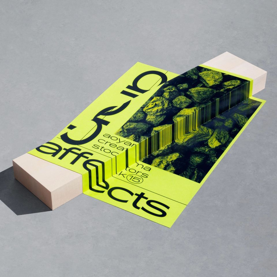
affects poster
TAKEO -
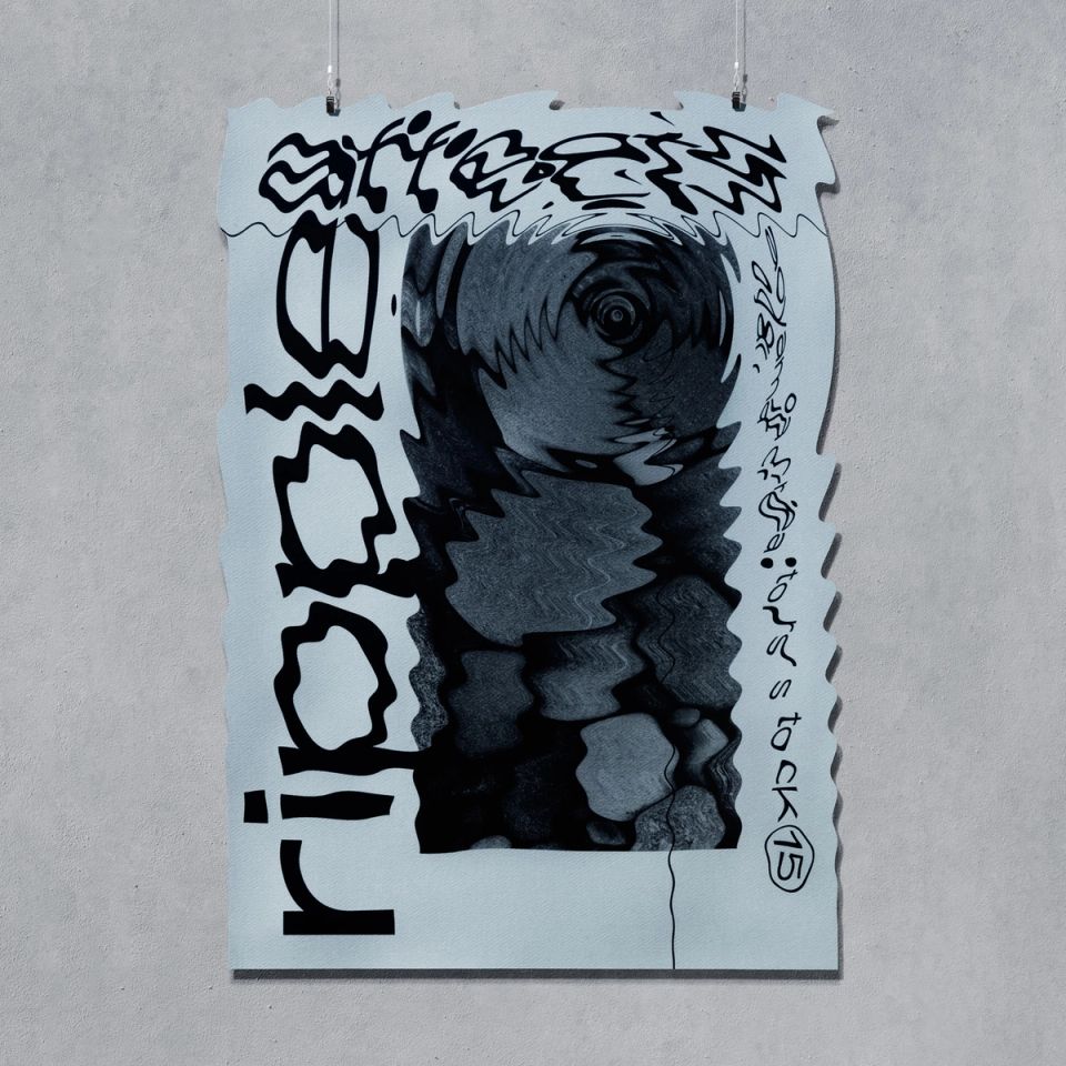
affects poster
TAKEO -
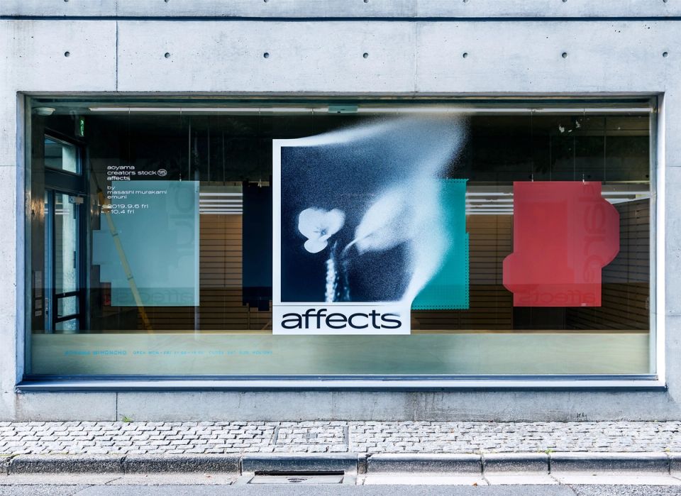
affects
TAKEO -
GRAPHIC TRIAL
TOPPAN -
KOUBA 2023 Graphic
KOUBA -
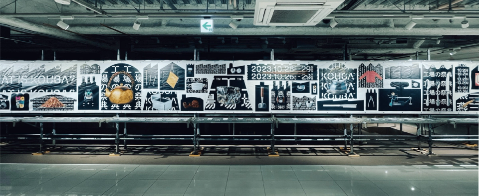
KOUBA 2023 Visual
KOUBA -
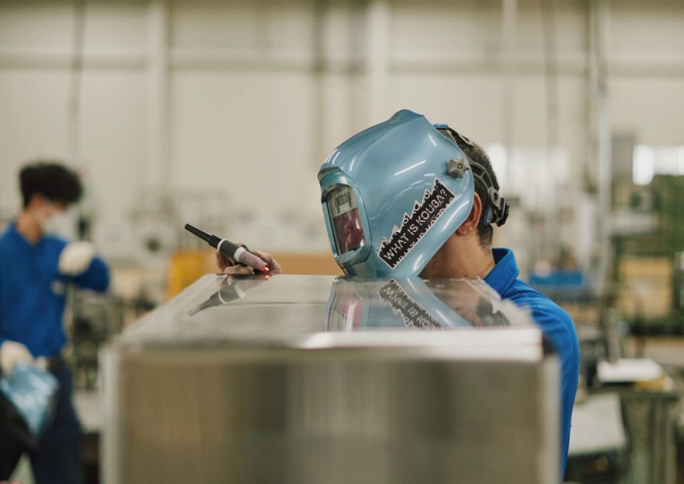
KOUBA 2023 Scene
KOUBA -
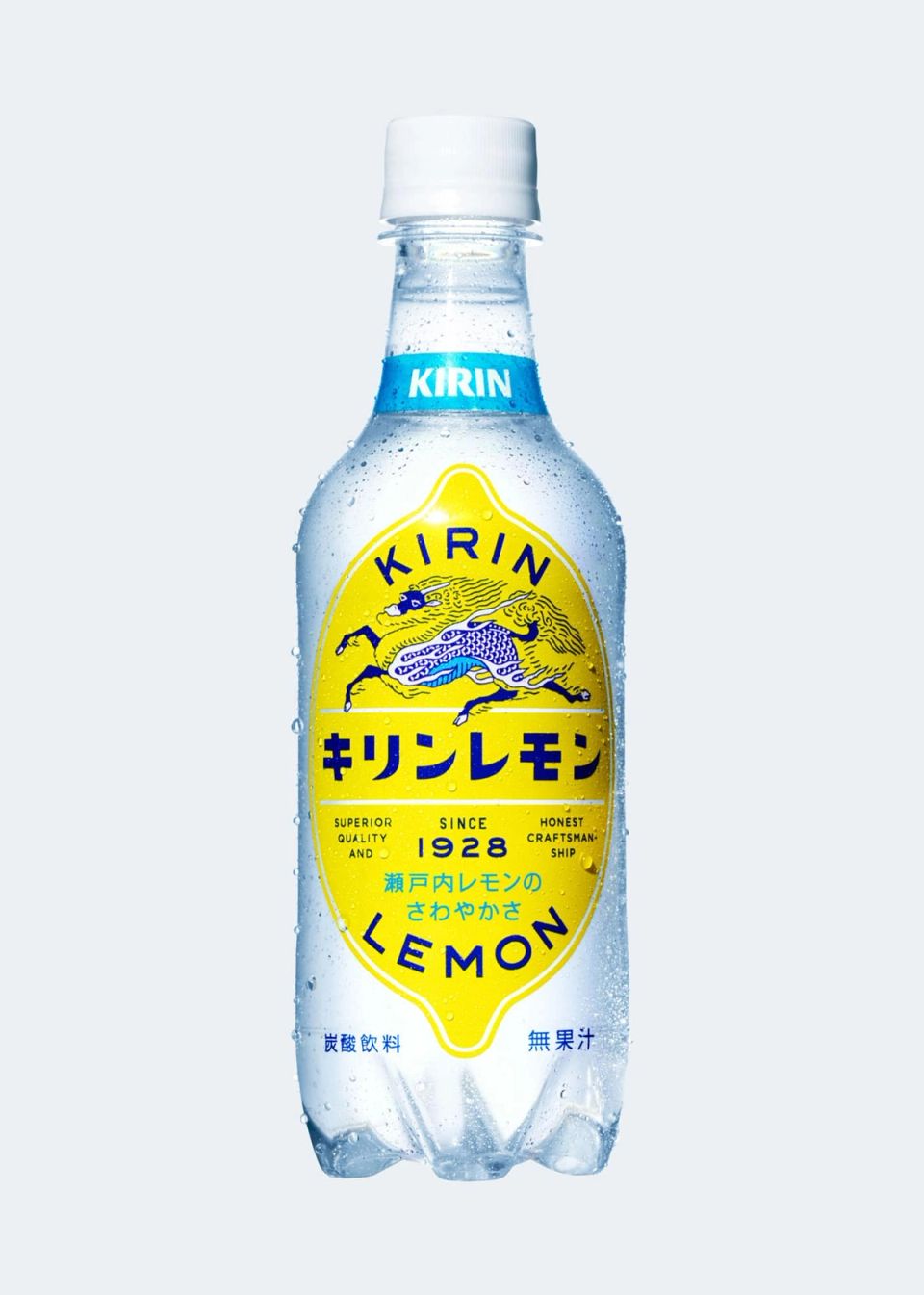
KIRIN LEMON 2020 Package
KIRIN beverage -
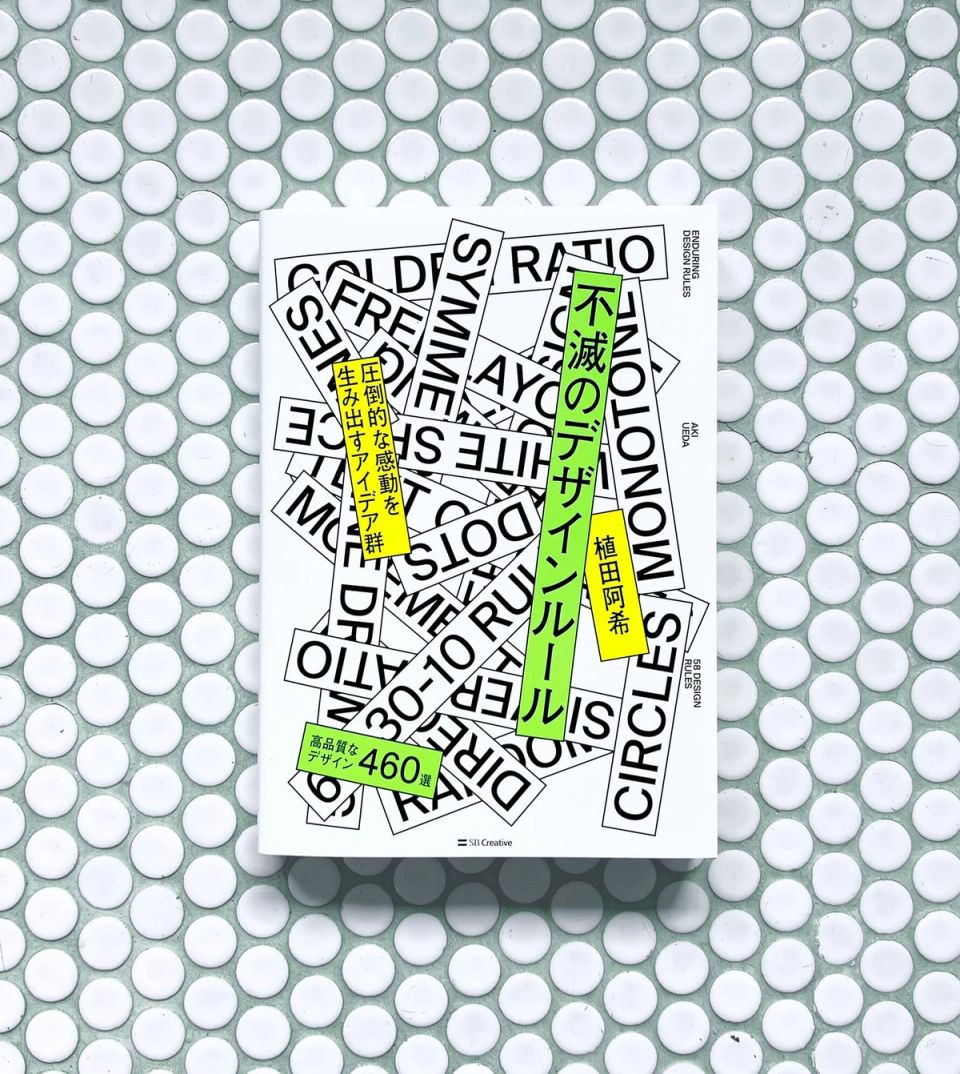
Immortal Design Rule
SB CREATIVE -
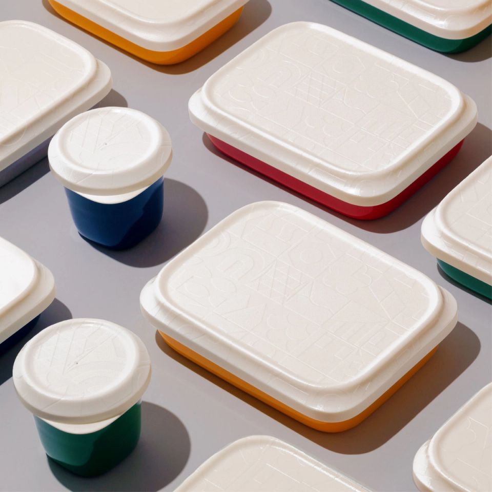
KOBE CITY LUNCH BOX
KOBE CITY -
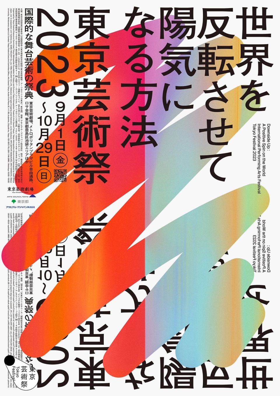
Tokyo Festival 2023
Tokyo Festival Executive Committee -
MAU IAS ”TRANSITION“
Musashino Art University -
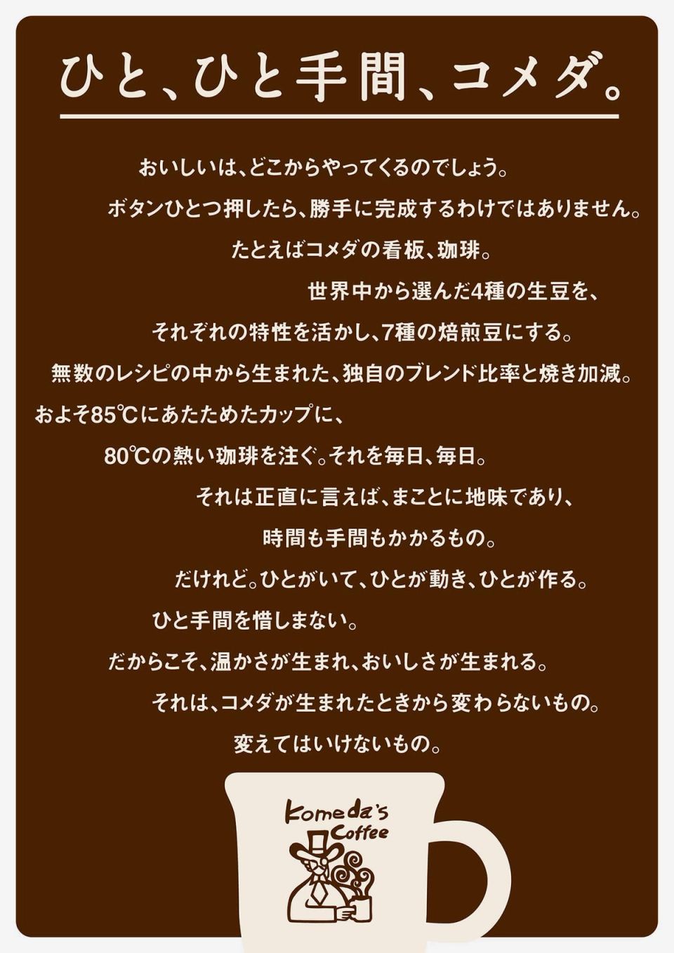
Komeda Coffee Statement
Komeda -
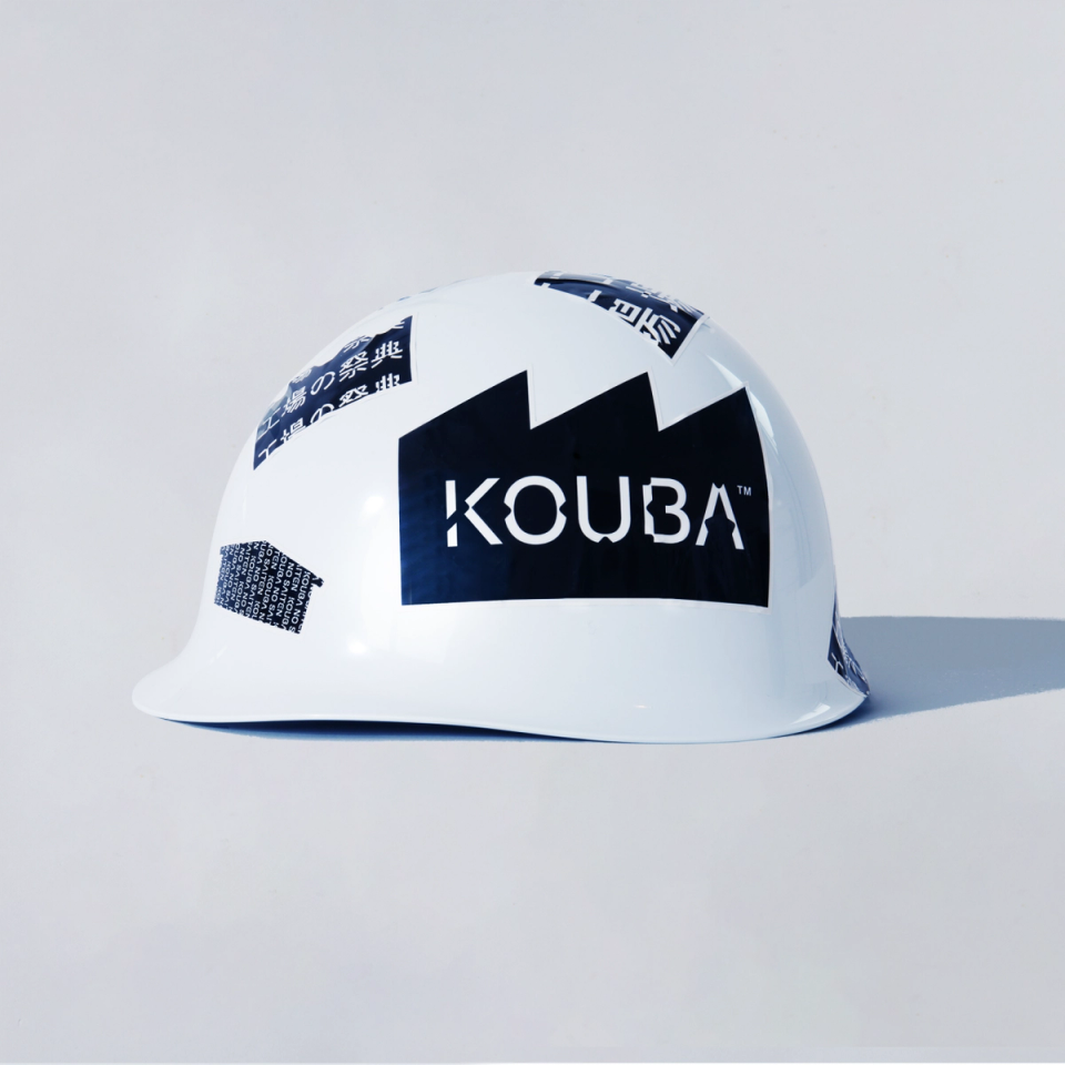
KOUBA 2023 Tool
KOUBA -
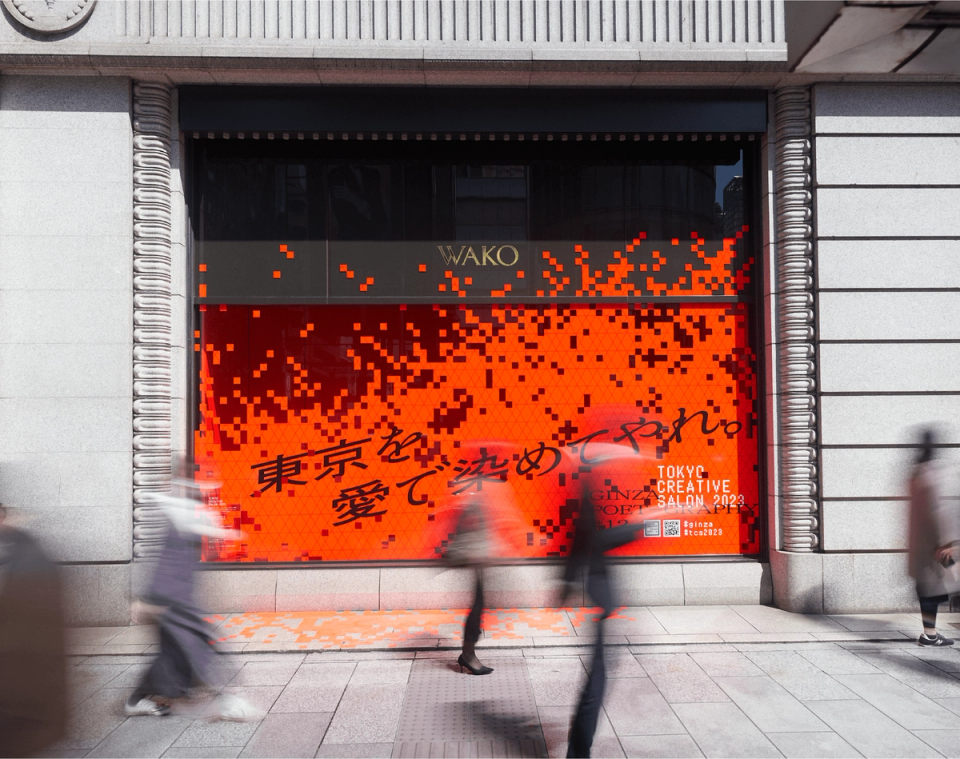
GINZA POET-GRAPHY
TOKYO CREATIVE SALON -
Musashino Art University IAS 2023
Musashino Art University -
CHAINSAW MAN BD/DVD Vol.1-4
MAPPA -
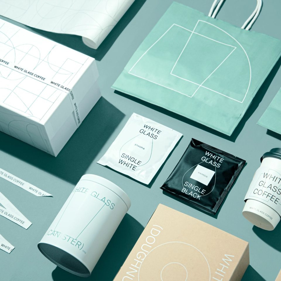
WHITE GLASS COFFEE
ROYAL ARTS -
Liu Jianhua Fluid voids
Towada Art Center -
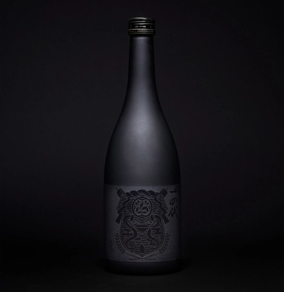
JUYONDAI International 2017
JCSC + Takagi Brewery -
Musashino Art University IAS 2022
Musashino Art University -
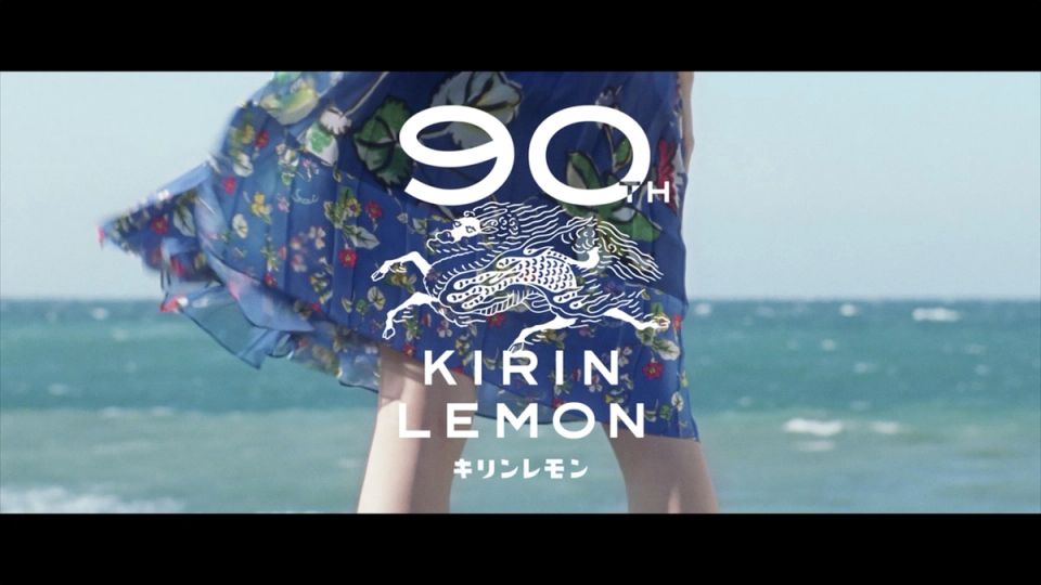
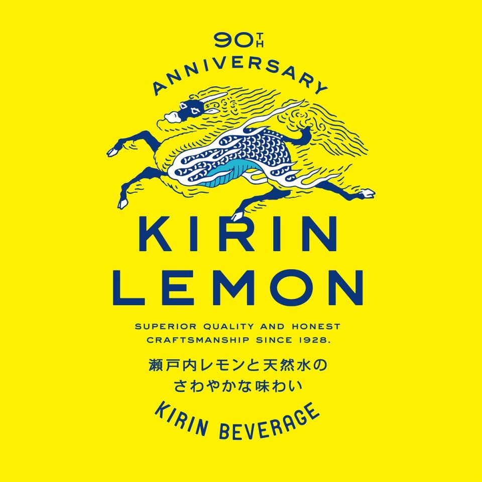
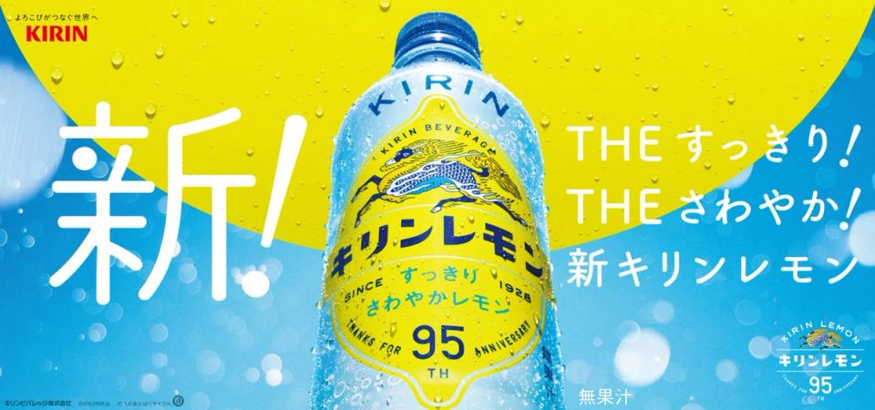
KIRIN LEMON 95th Advertising
KIRIN beverage -
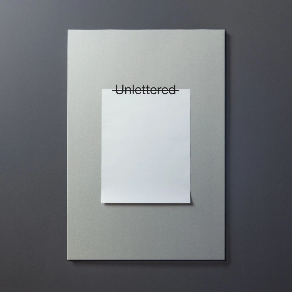
Unlettered
-
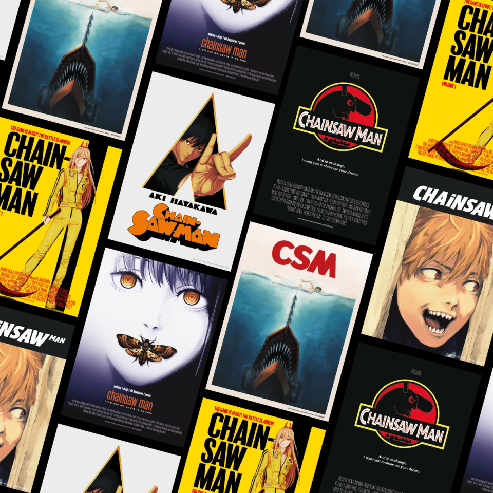
CHAINSAW MAN BD/DVD BOX
MAPPA -
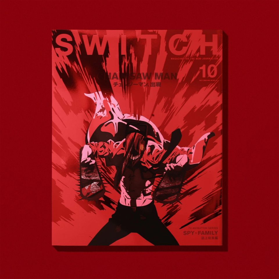
SWITCH 2022/10 CHAINSAW MAN
Switch Publishing -
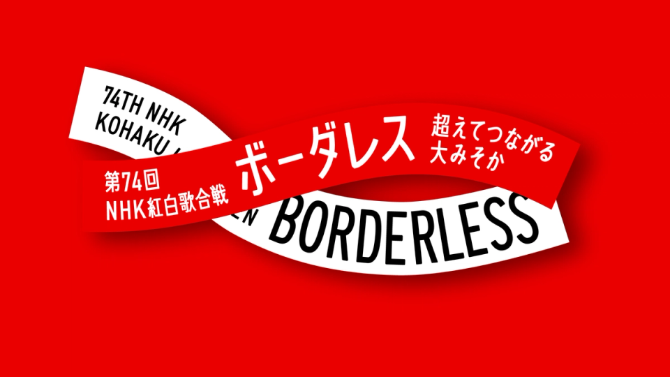
NHK KOUHAKU
NHK -
SETOMANEKI
CHUGAI TOEN -
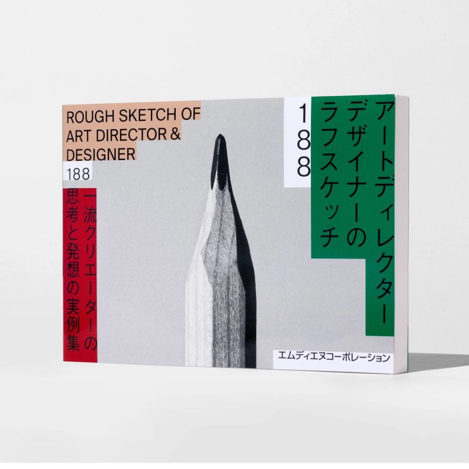
ROUGH SKETCH OF ART DIRECTOR & DESIGNER 188
MdN -

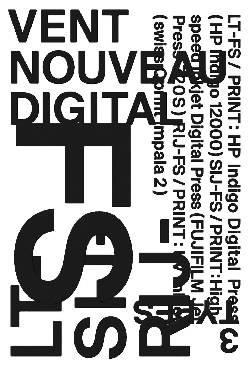
VENT NOUVEAU DIGITAL / face
TAKEO -
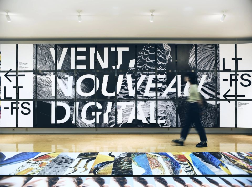
VENT NOUVEAU DIGITAL Exhibition
TAKEO -
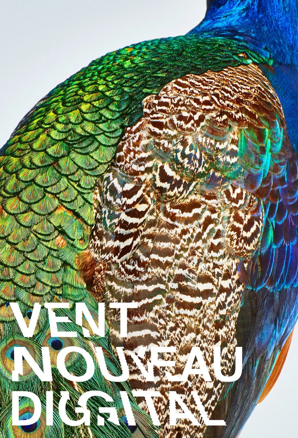
VENT NOUVEAU DIGITAL / bird
TAKEO -
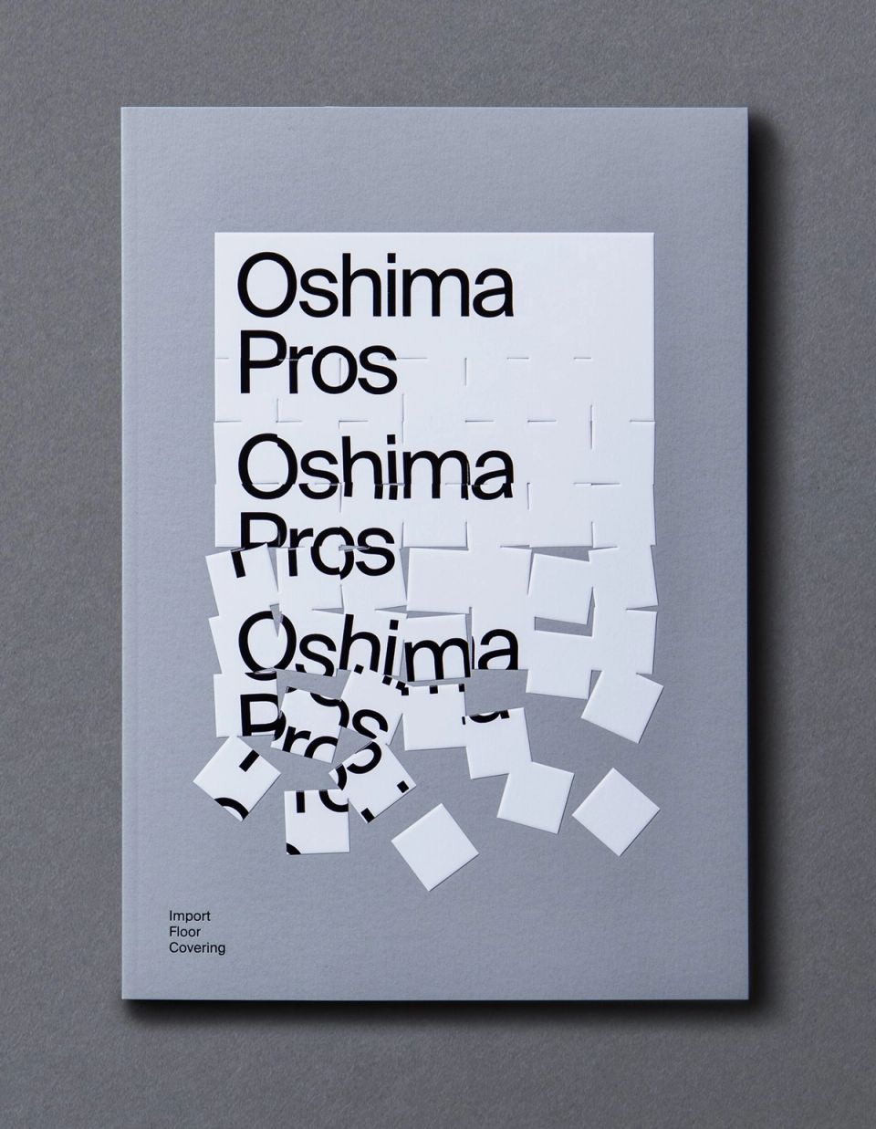
Oshima Pros 2019 Catalog
Oshima Pros -
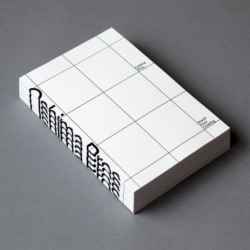
Oshima Pros 2020 Catalog
Oshima Pros -
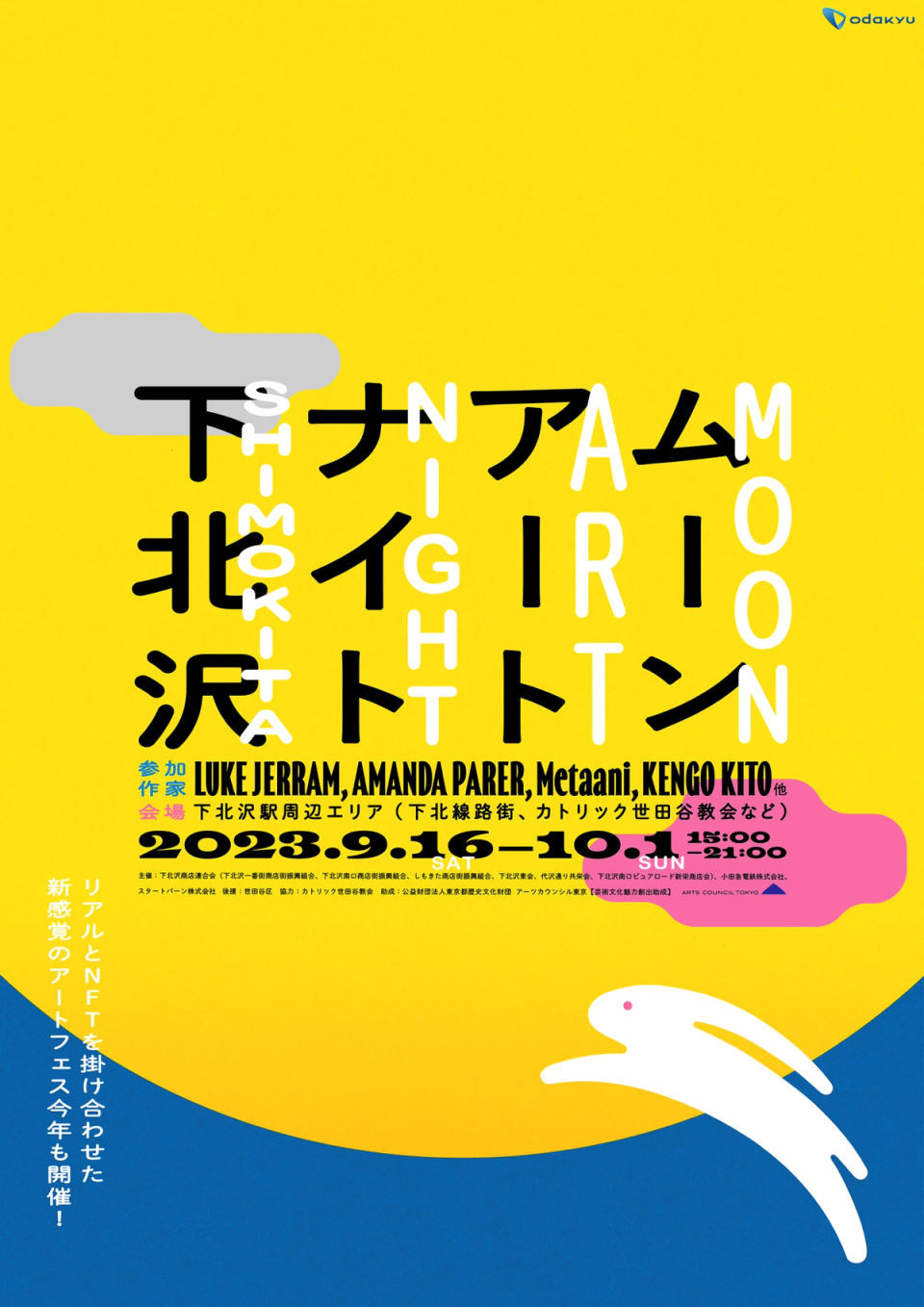
MOON ART NIGHT SHIMOKITAZAWA 2023
Startbahn / Startbahn -
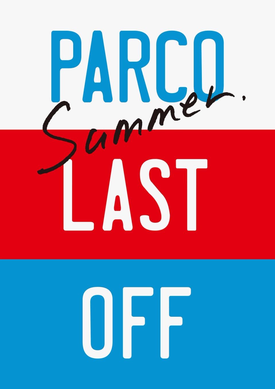
PARCO Summer LAST OFF
PARCO -
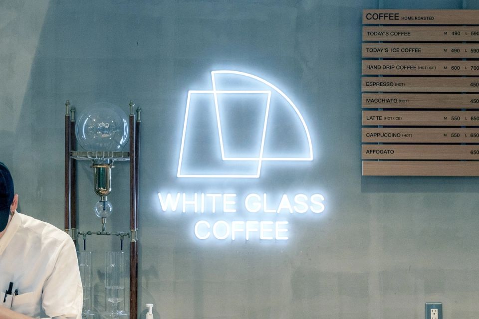
WHITE GLASS COFFEE sign
RoyalArts -
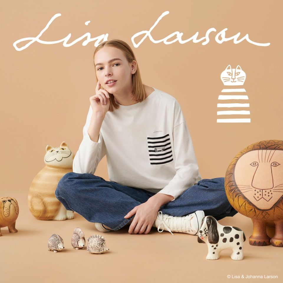
UT Lisa Lason Collection
UNIQLO -
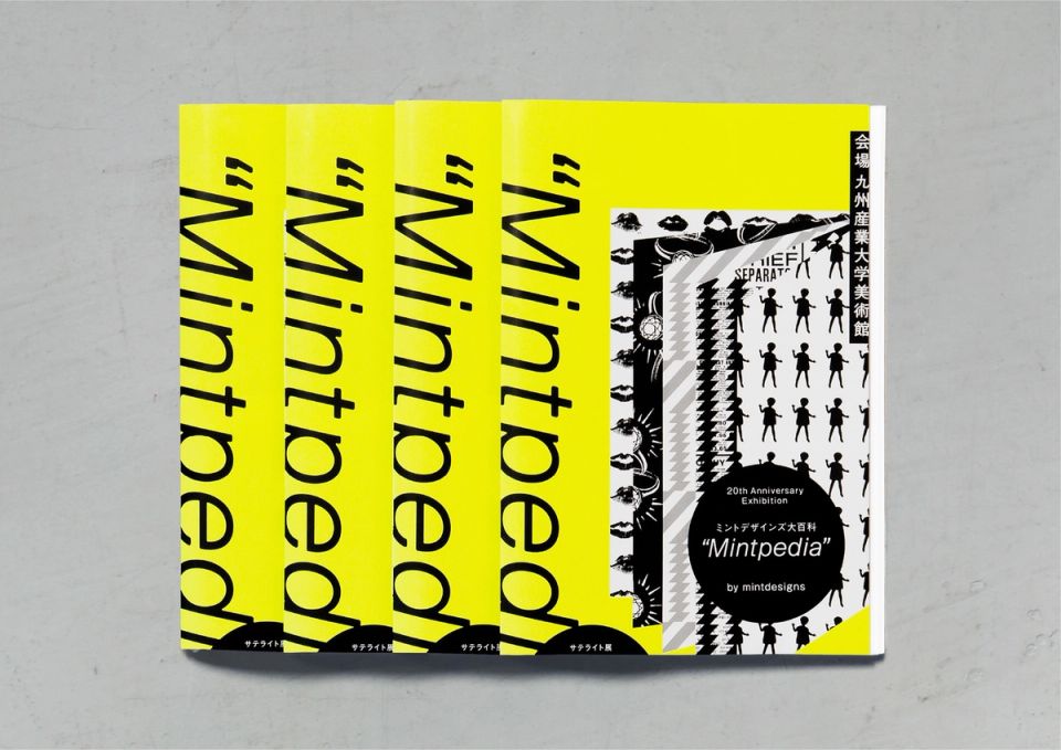
Mintpedia / mintdesigns
mintdesigns -
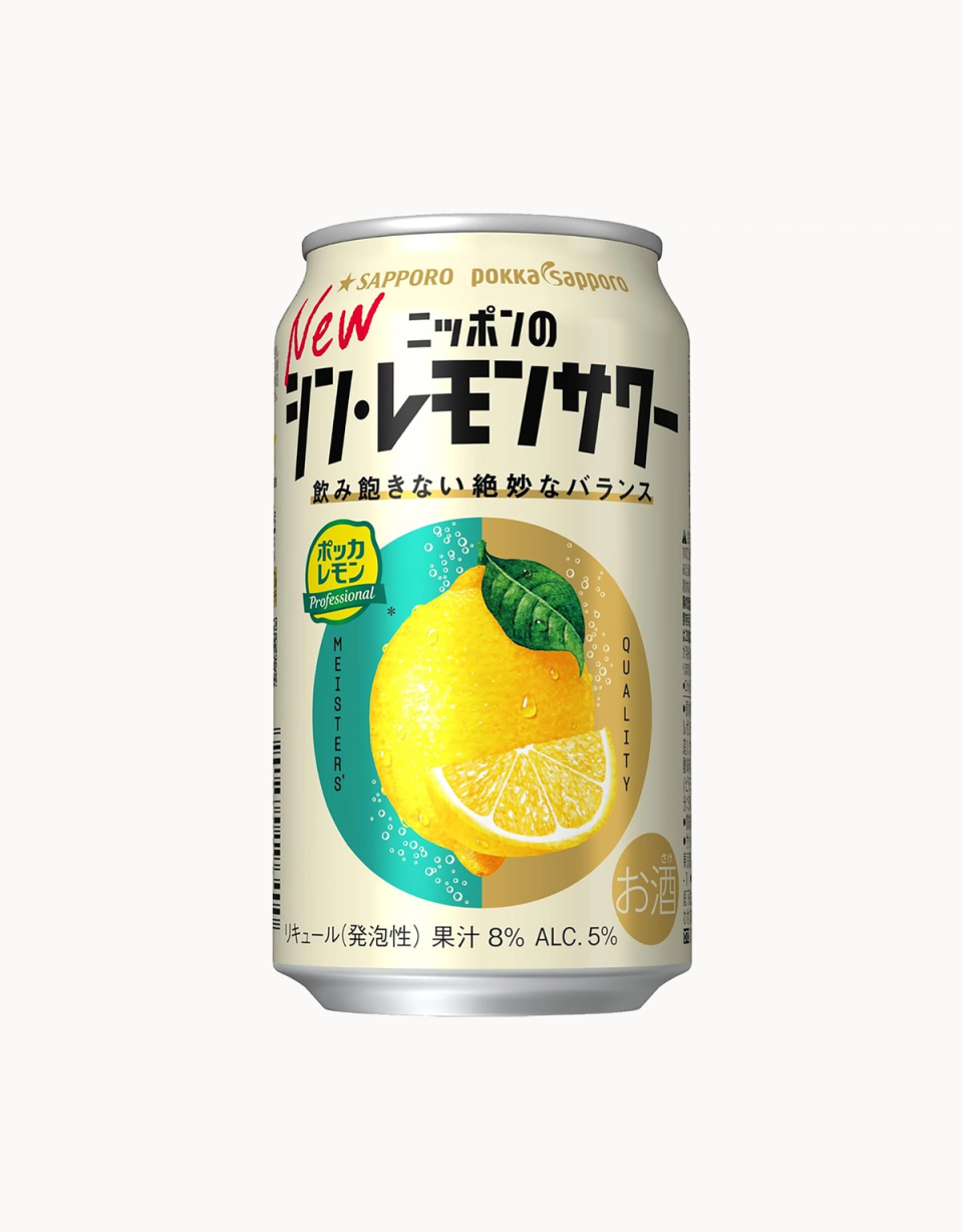
Shin Lemon Sour 2025
Sapporo Breweries -
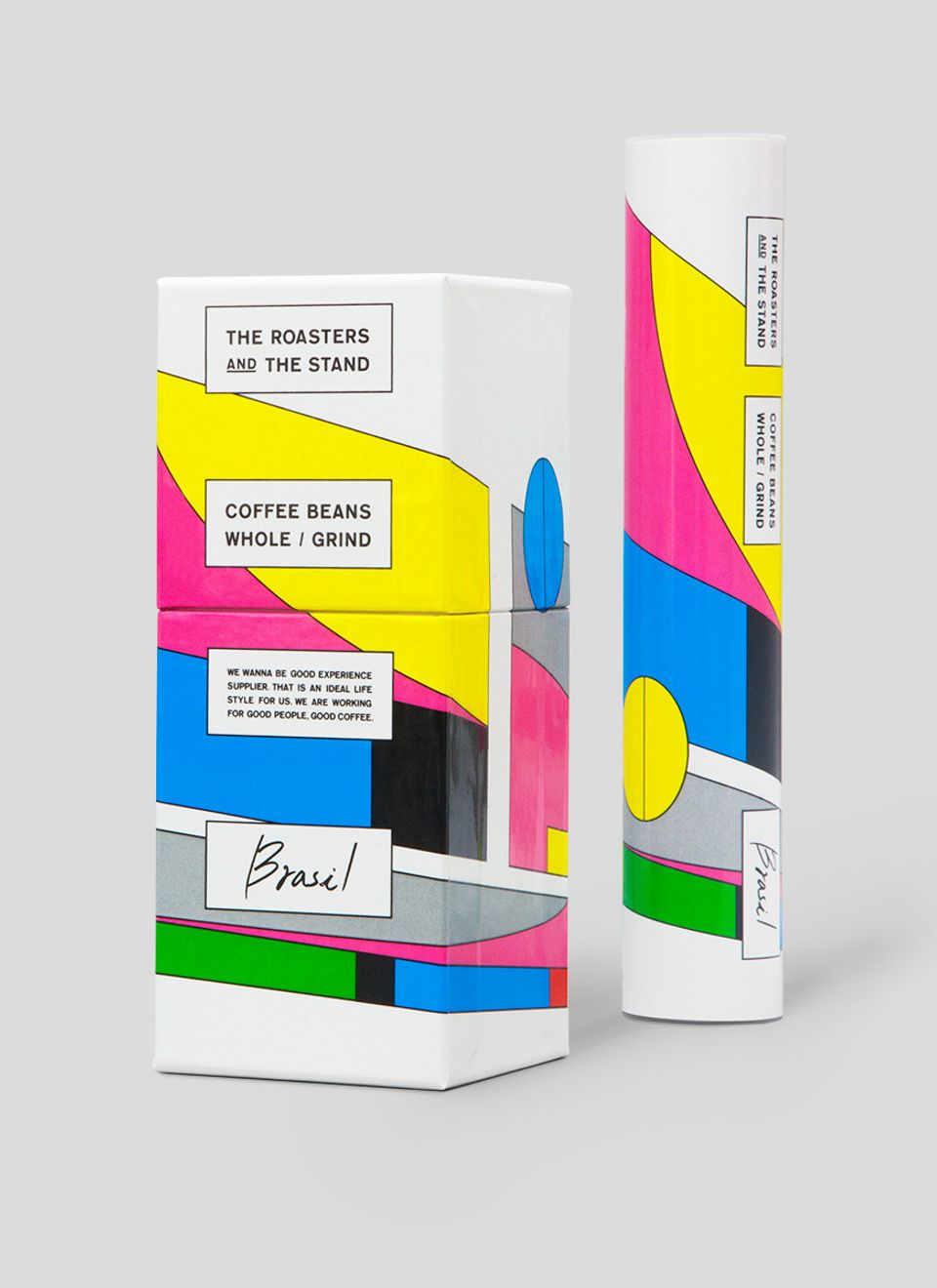
THE ROASTERS AND THE STAND
Roasters -
KIRIN LEMON non-suger CM
Kirin Beverage -
未来をひらく窓
YKK AP -
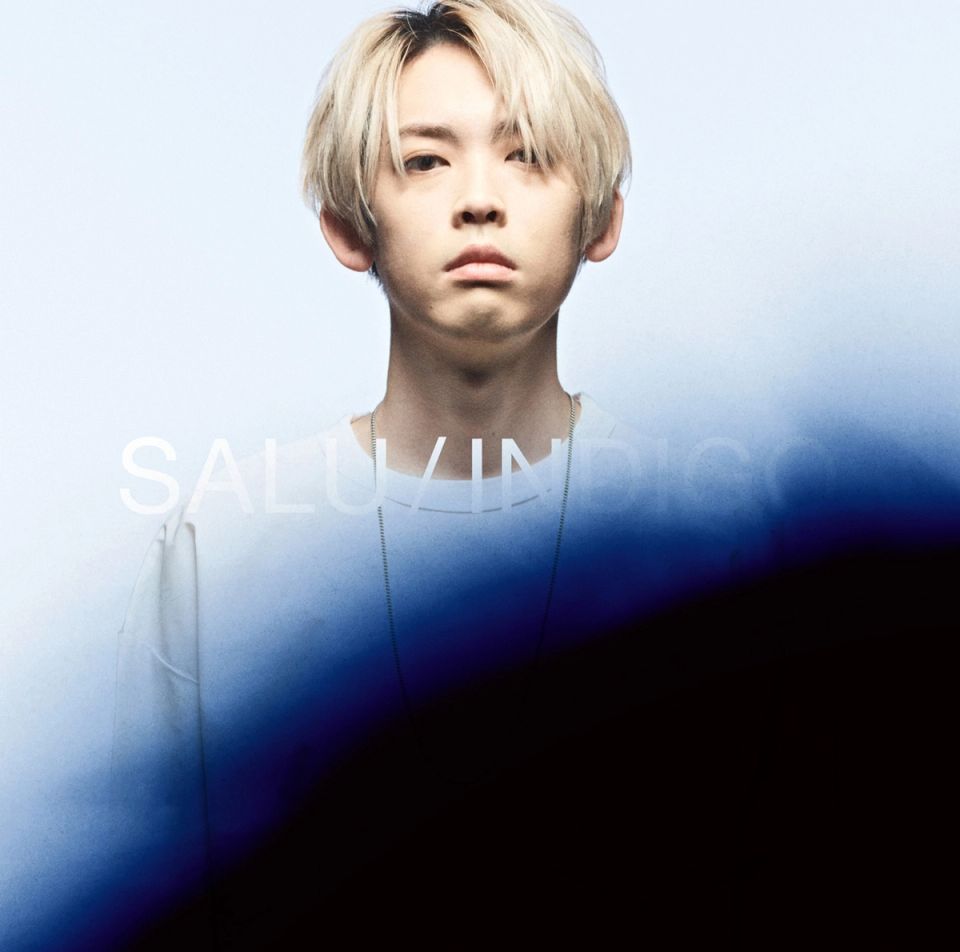
SALU / INDIGO
TOY’S FACTORY -
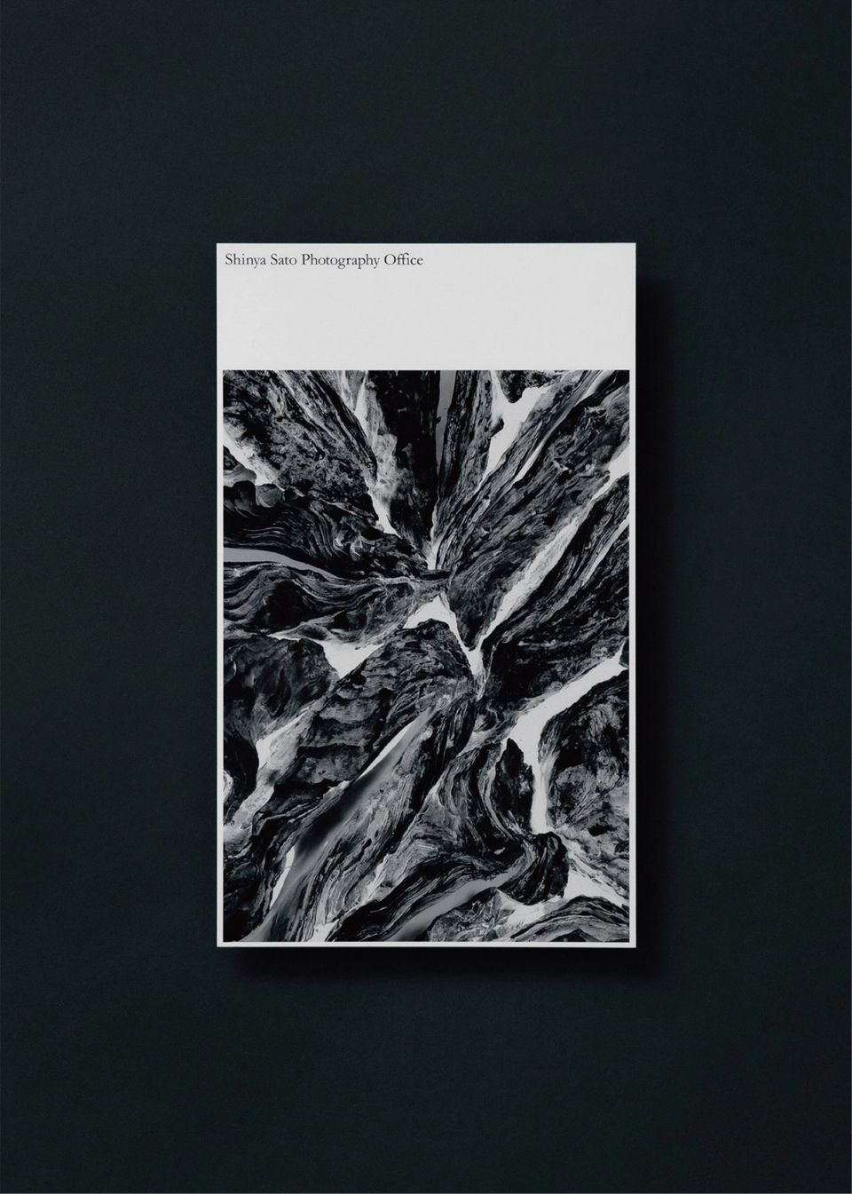
Shinya Sato Photography Office / New Year Card
Shinya Sato Photography Office -
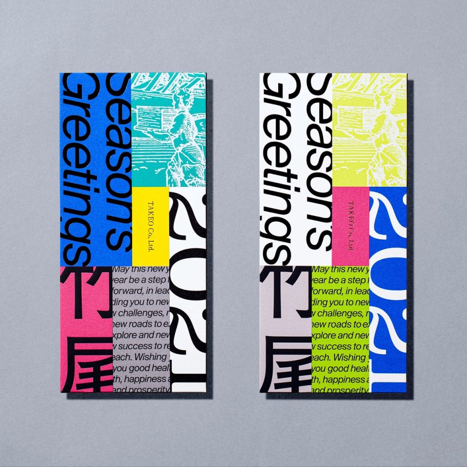
TAKEO / NEW YEAR GREETINGS
TAKEO -
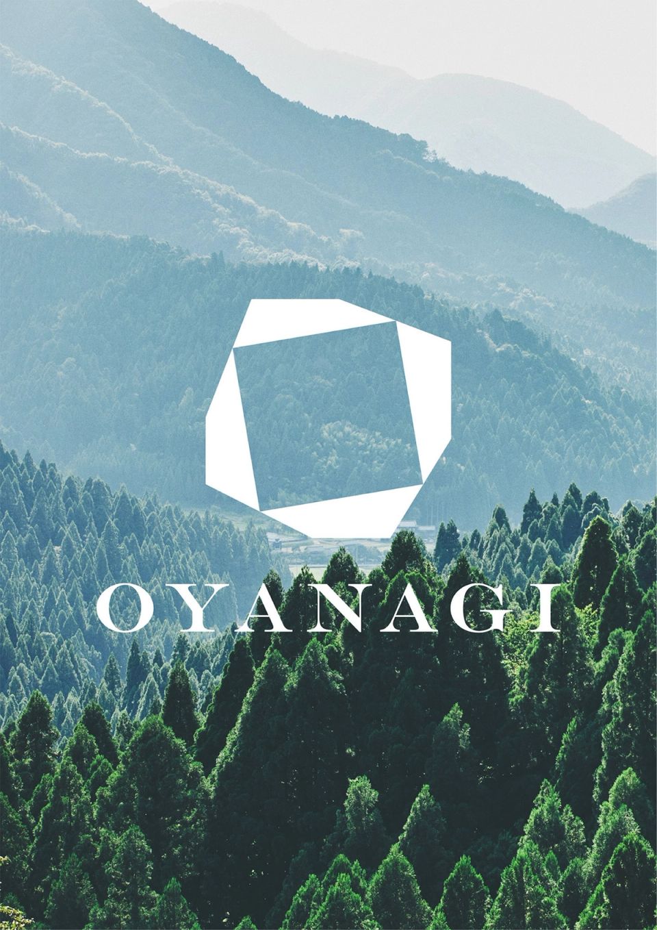
OYANAGI
oyanagi tansu -
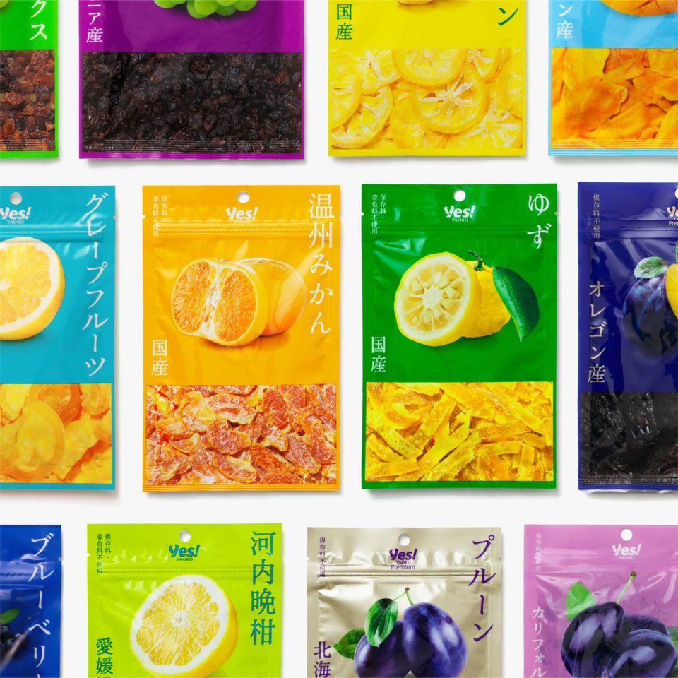
Yaoko PB 2023
YAOKO -
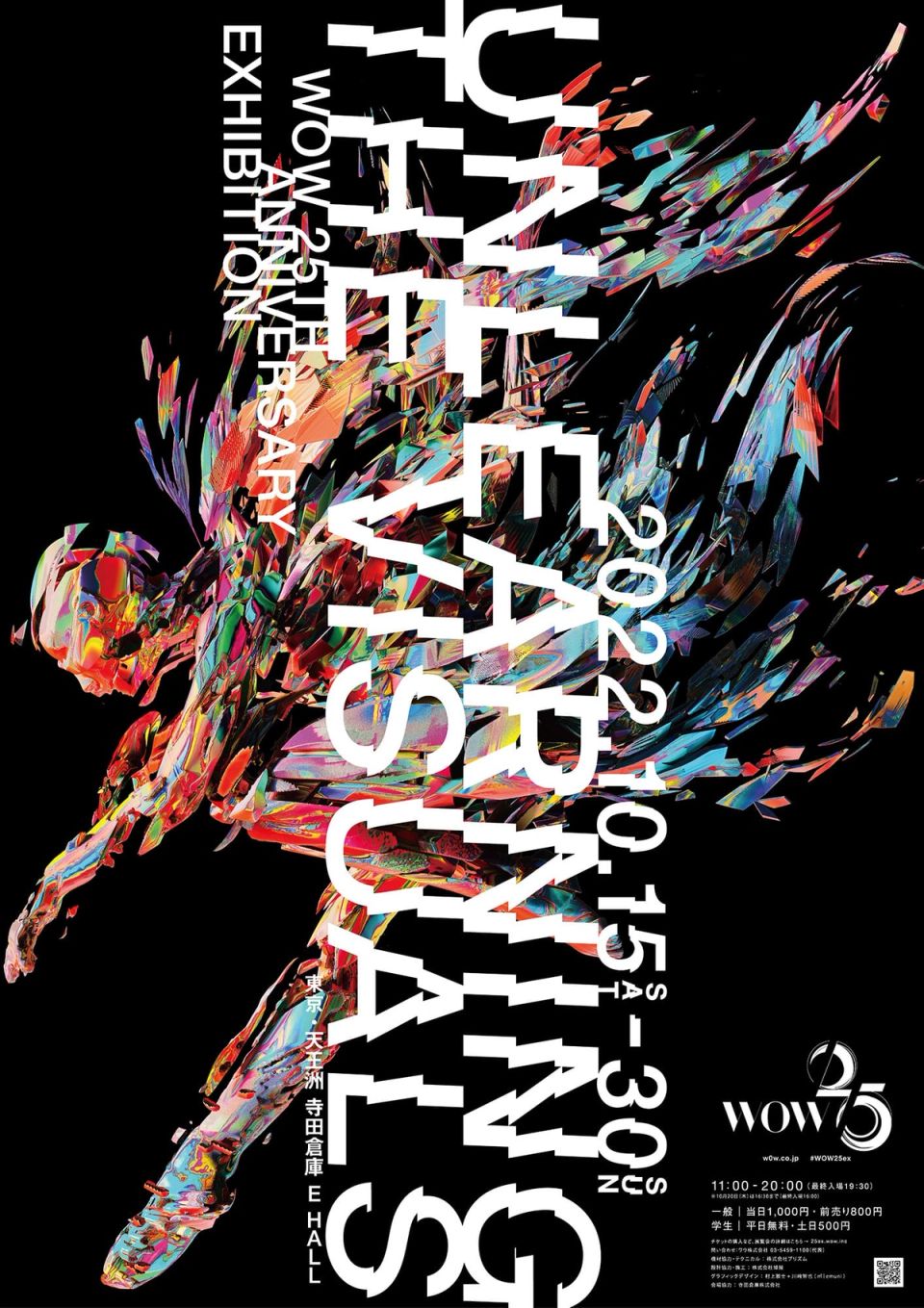
WOW / UNLEARNING THE VISUALS
WOW -
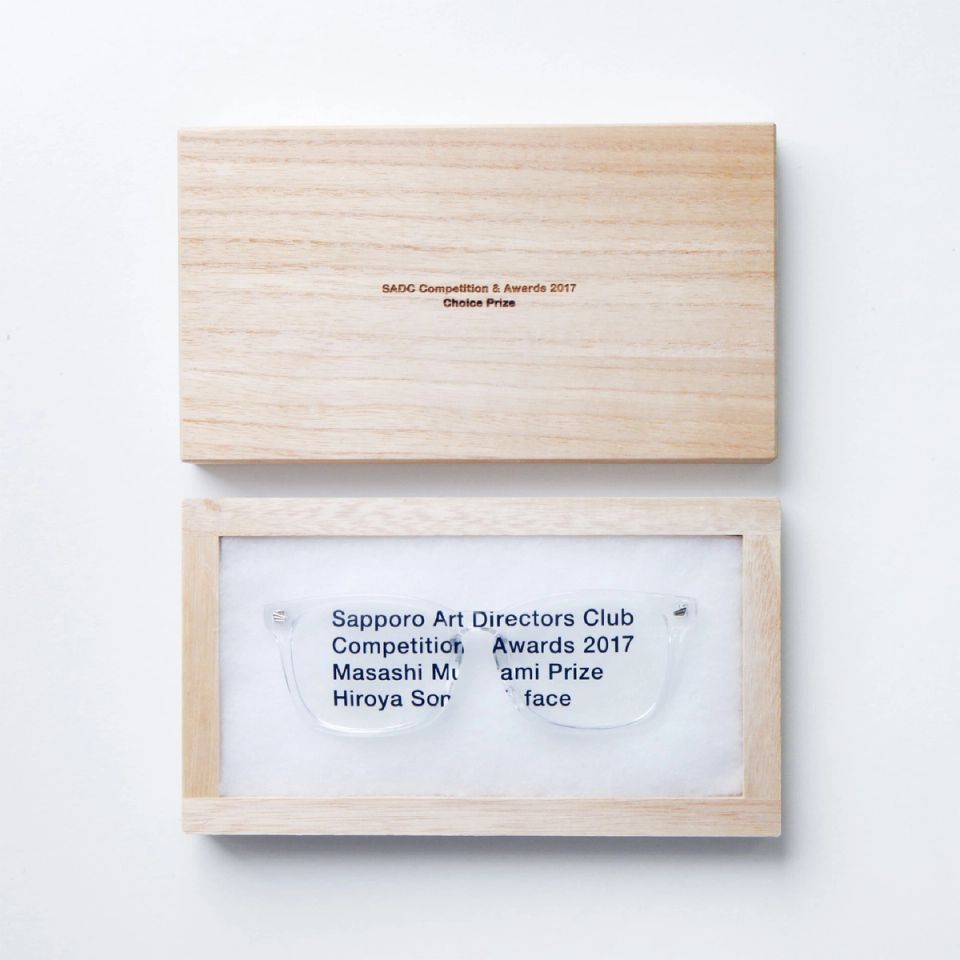
Trophy of “Masashi Murakami Prize”
Sapporo Art Directors Club -
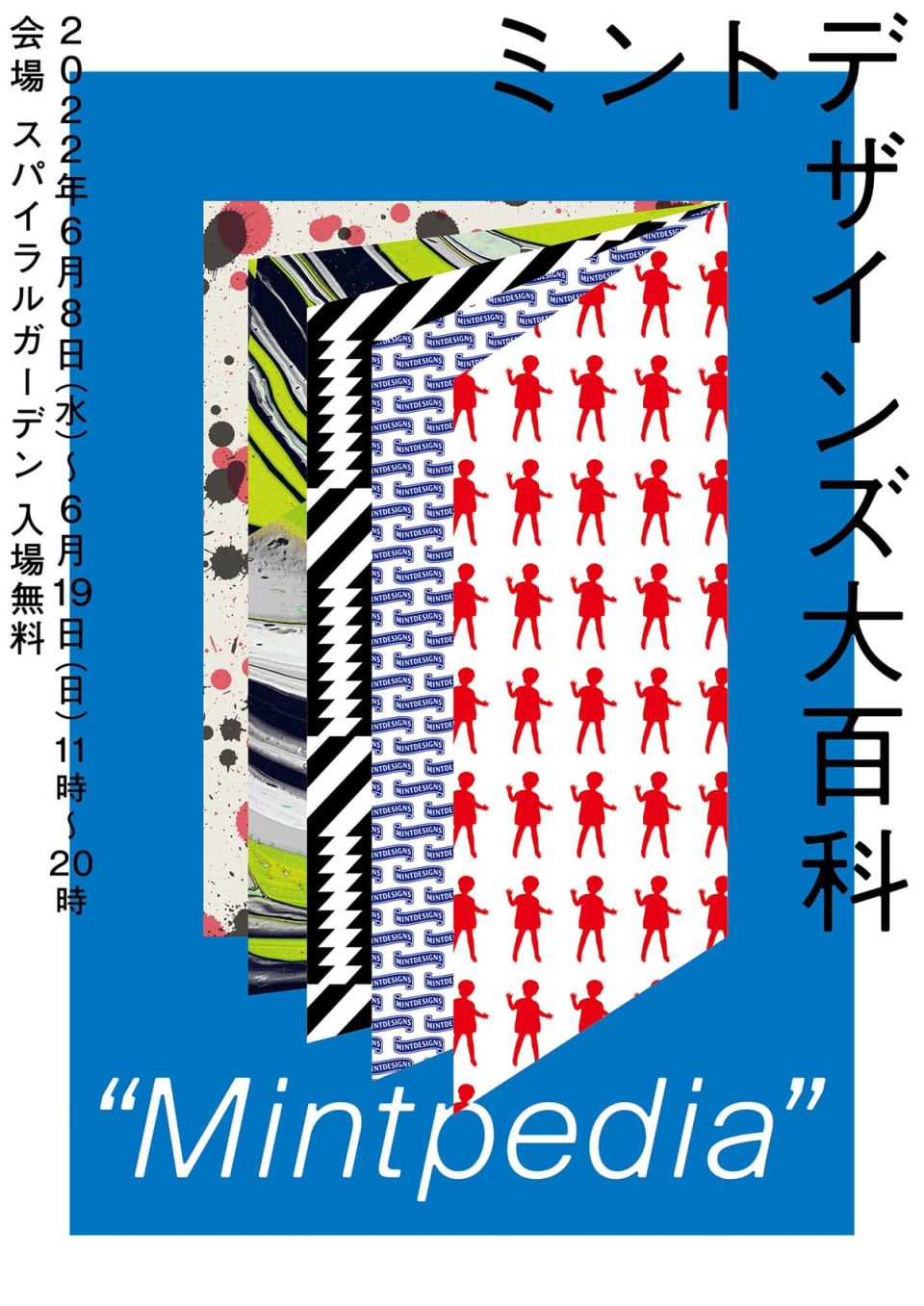
Mintpedia exhibition
mintdesigns -
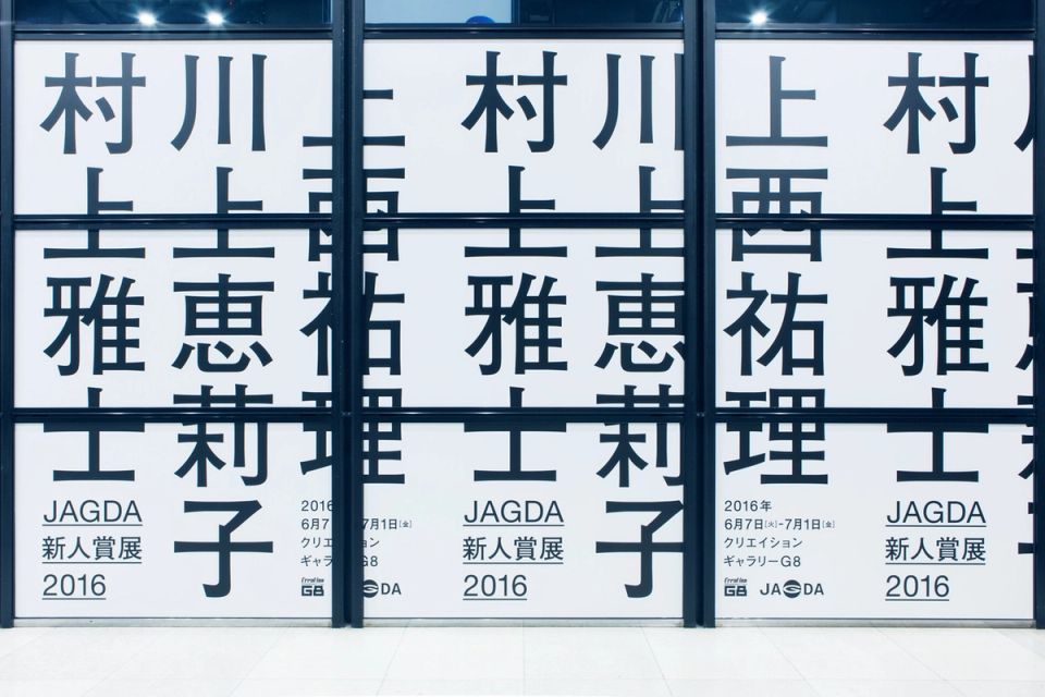
JAGDA New Designer Awards 2016
JAGDA -

LOADING
Roasters -
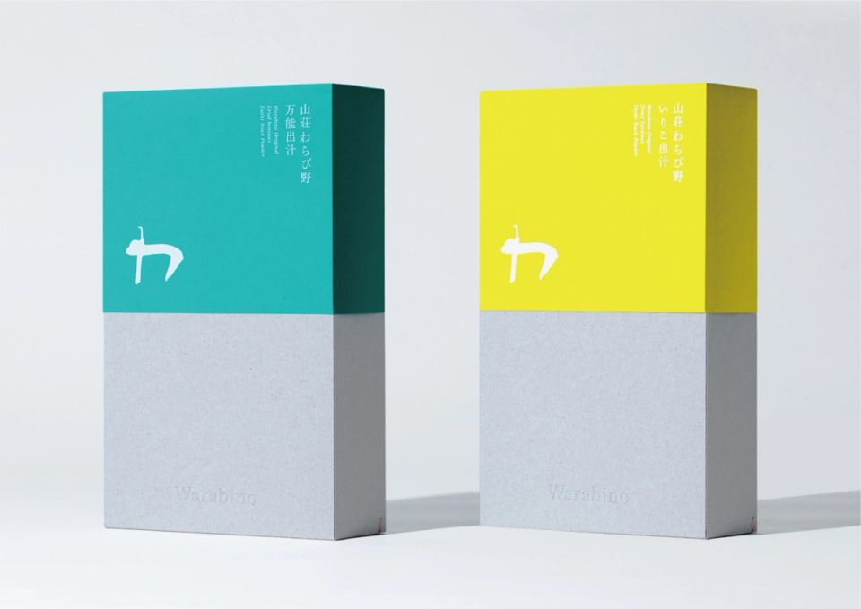
Warabino dashi
Warabino -
KOSEN
Kosengama -
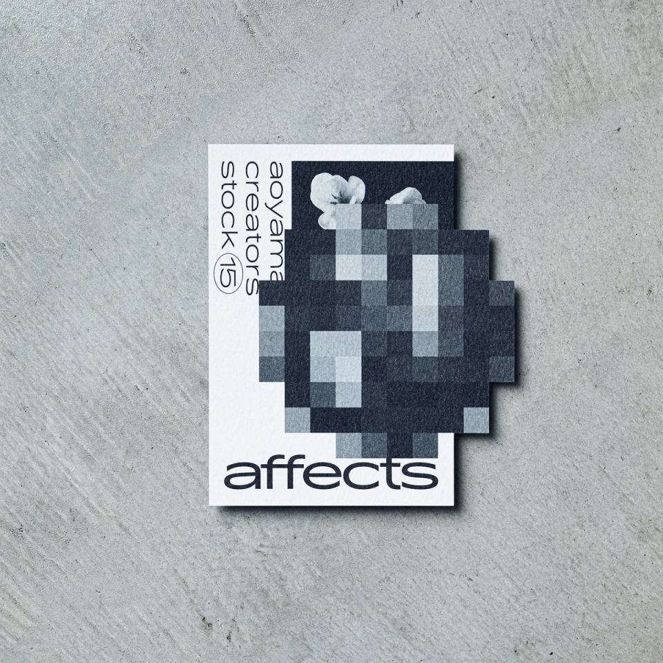
affects DM
TAKEO -
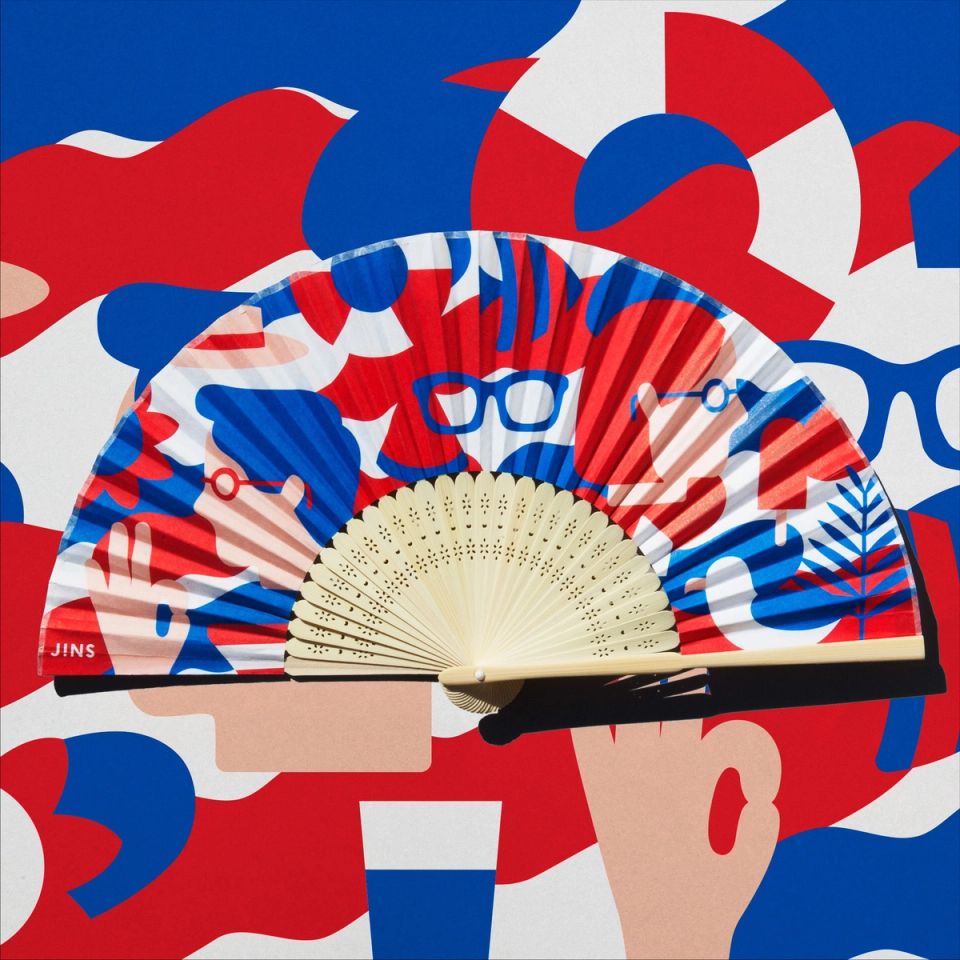
JINS “SUMMER CAMPAIGN 2018”
JINS -
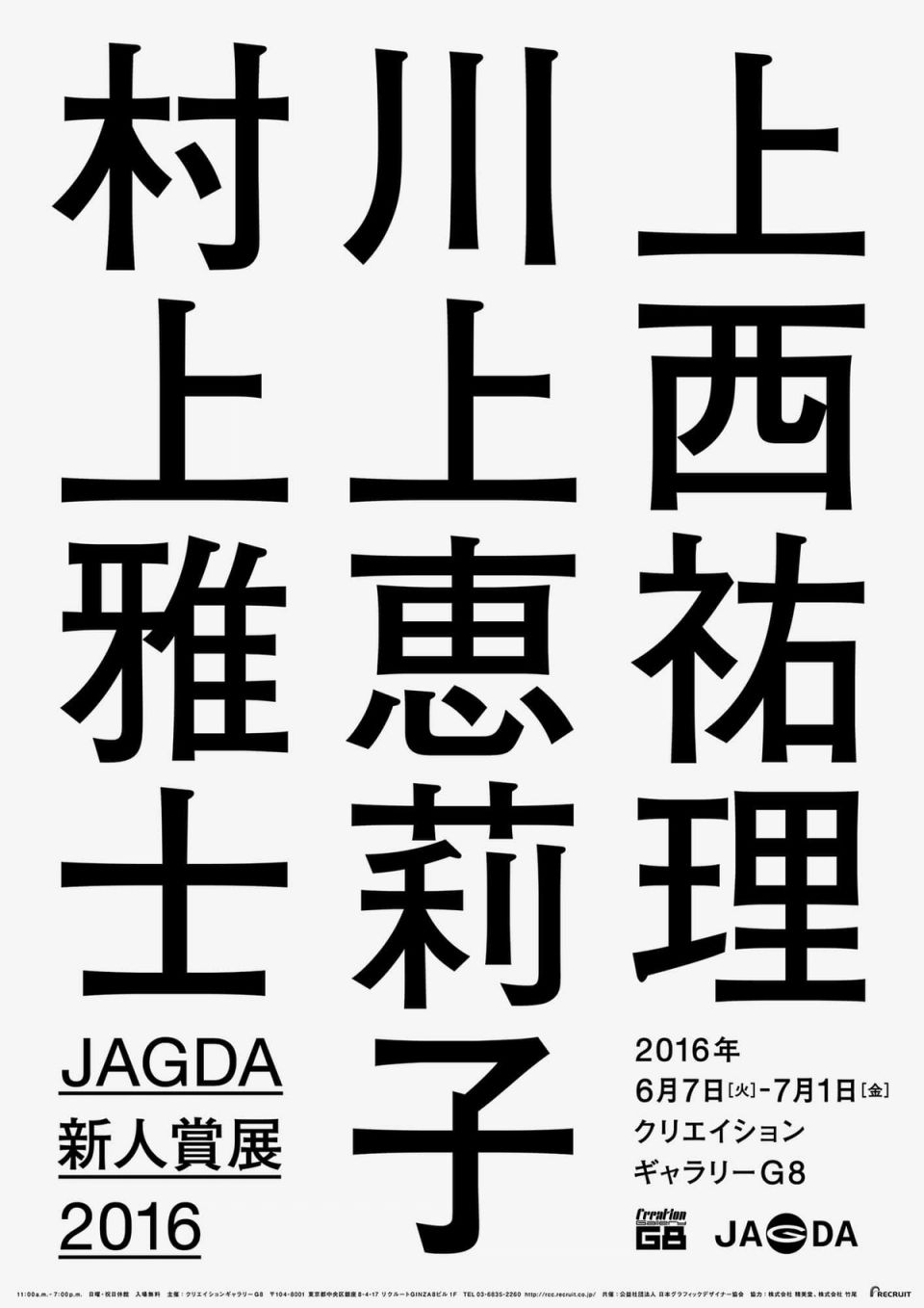
JAGDA New Designer Awards 2016
JAGDA -
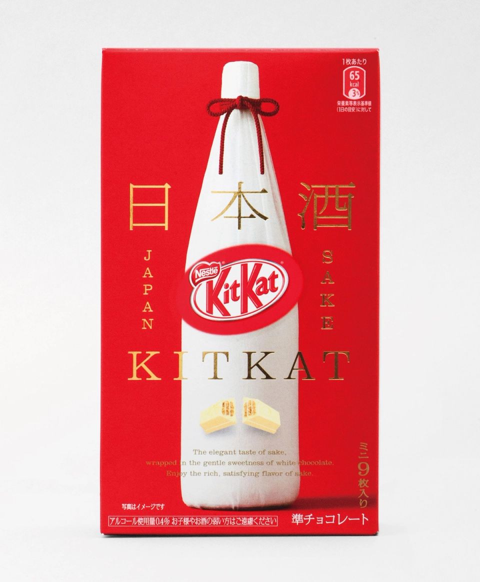
SAKE KITKAT
Nestlé Japan -
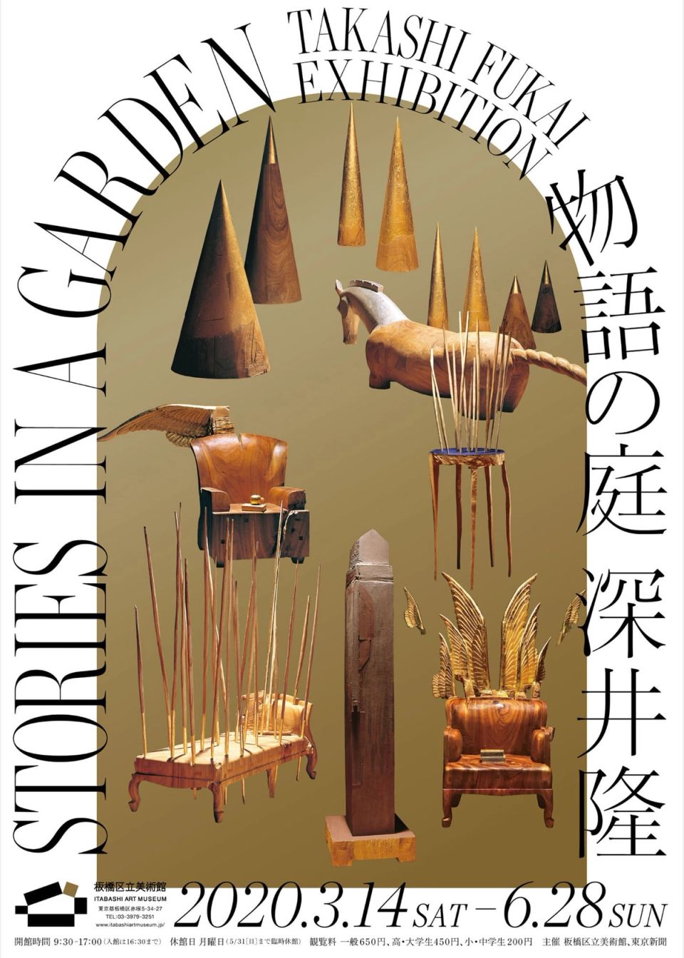
Takashi Fukai Exhibition: Stories in a Garden
ITABASHI ART MUSEUM -
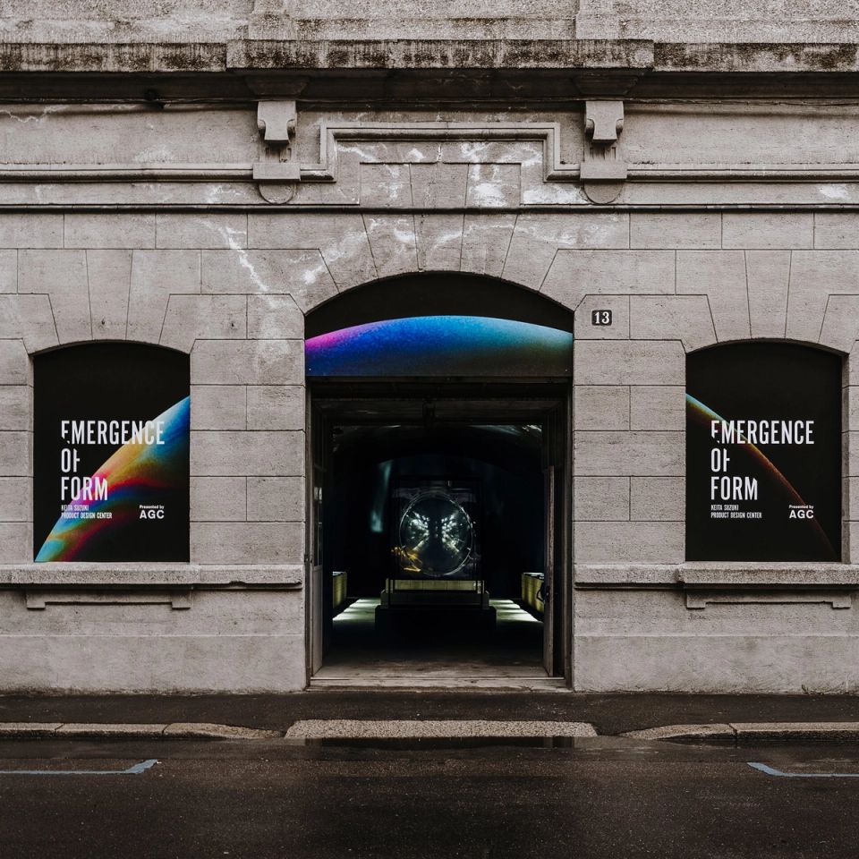
AGC “EMERGENCE OF FORM” at Milano Design Week
AGC -
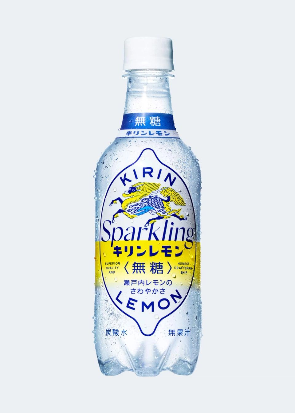
KIRIN LEMON SPARKLING 2018 Package
KIRIN beverage -
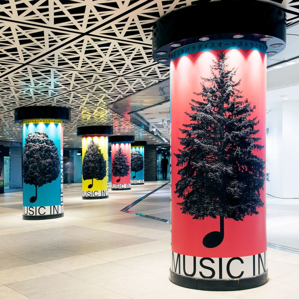
MUSIC IN THE PARK
Ginza Sony Park -
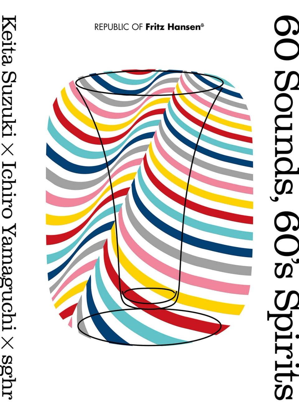
“60 Sounds, 60′s Spirits” Keita Suzuki × Ichiro Yamaguchi × sghr
Fritz Hansen -
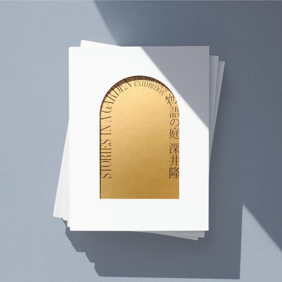
Takashi Fukai Exhibition: Stories in a Garden
ITABASHI ART MUSEUM -
n’
IIE -
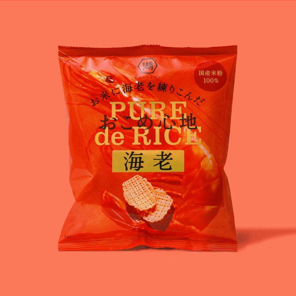
おこめ心地
KOIKE-YA -
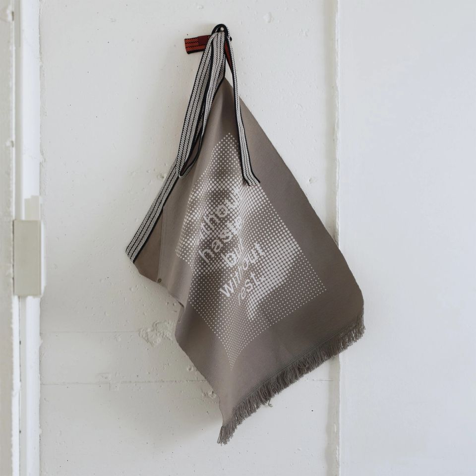
Without haste but without rest / G8 Charity Exhibition
Creation Gallery G8 -
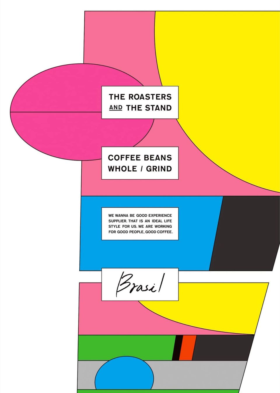
THE ROASTERS AND THE STAND
THE ROASTERS -
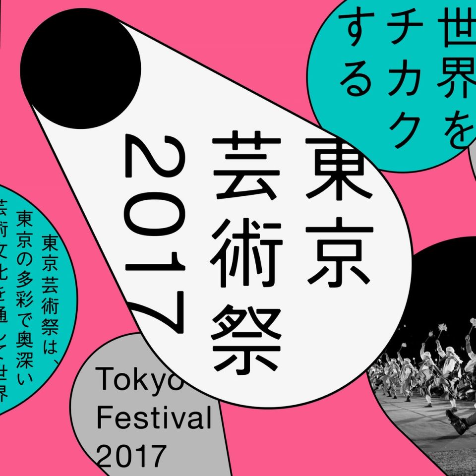
Tokyo Festival 2017
Tokyo Festival Executive Committee -
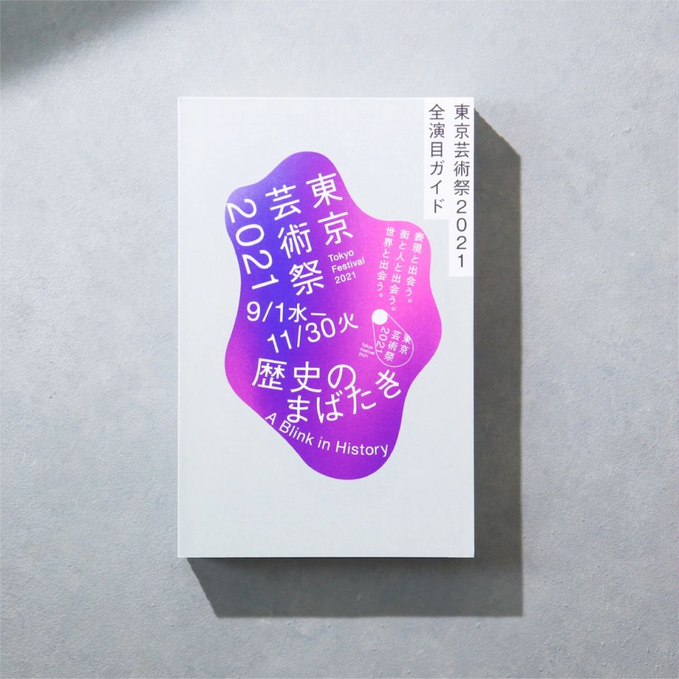
Tokyo Festival 2021 Pamphlet
Tokyo Festival Executive Committee -
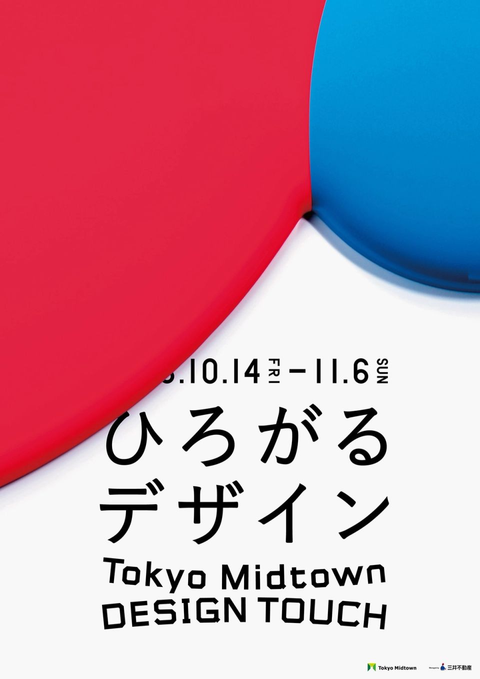
Tokyo Midtown DESIGN TOUCH 2016
Tokyo Midtown Management -
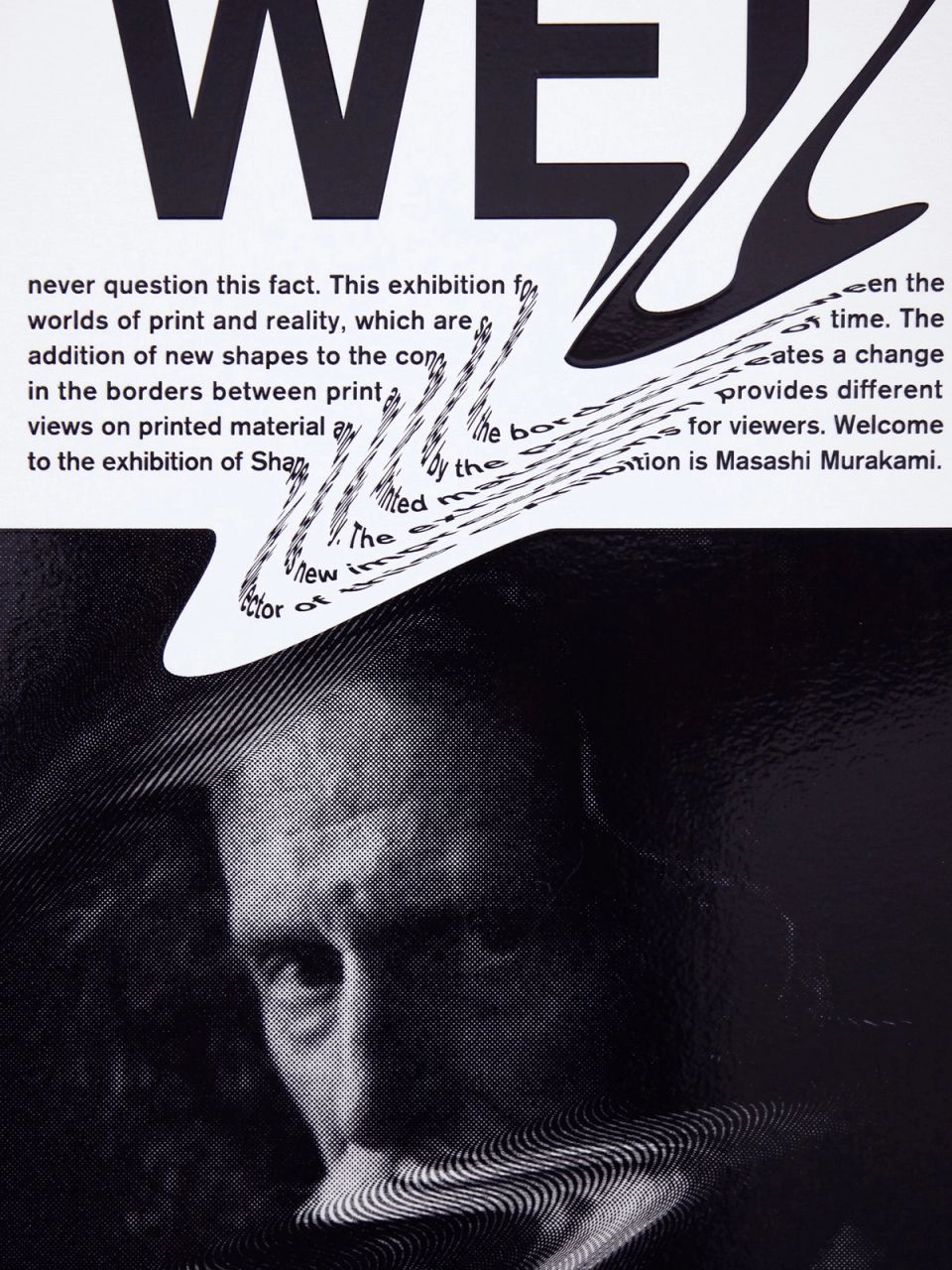
SHAPES
earth & salt -
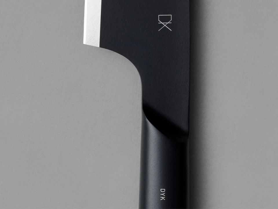
DYK
TAKAGI -
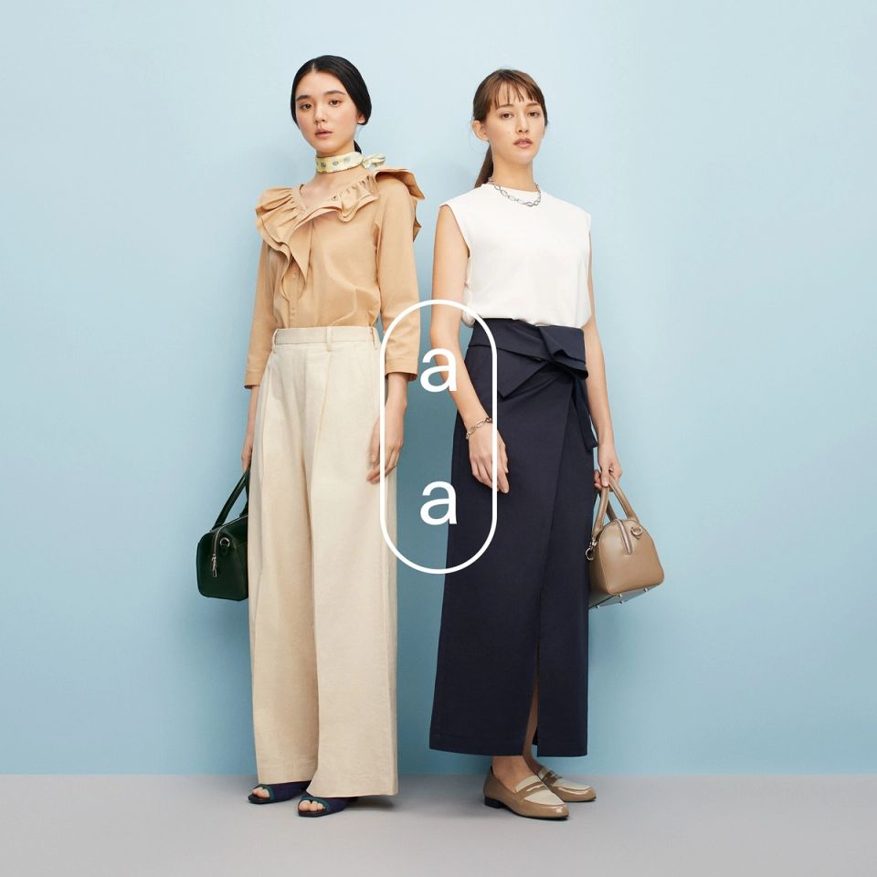
arm in arm
Isetan Mitsukoshi -
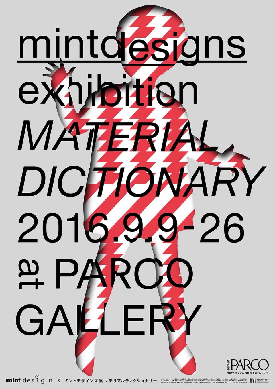
mintdesigns exhibition “Material Dictionary”
PARCO -
ginza paradise records
Ginza Sony Park -
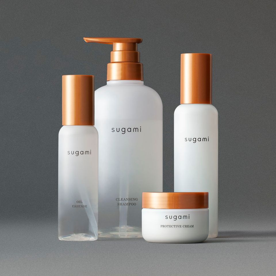
sugami
Unilever Japan -
KIRIN LEMON 2019 non-sugar Package
KIRIN beverage -
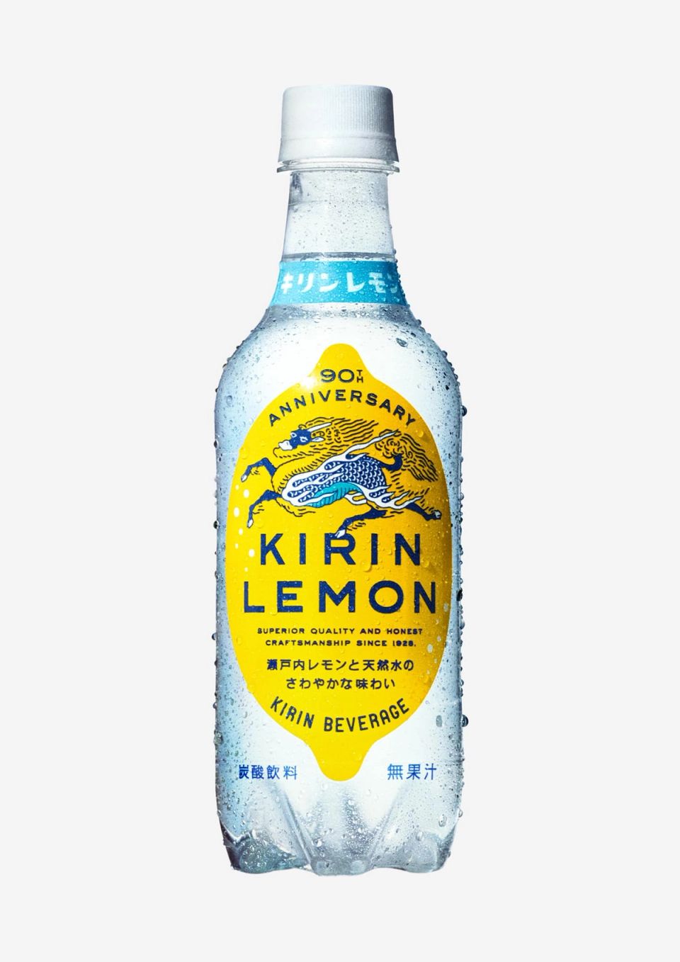
KIRIN LEMON 90th Package
KIRIN beverage -
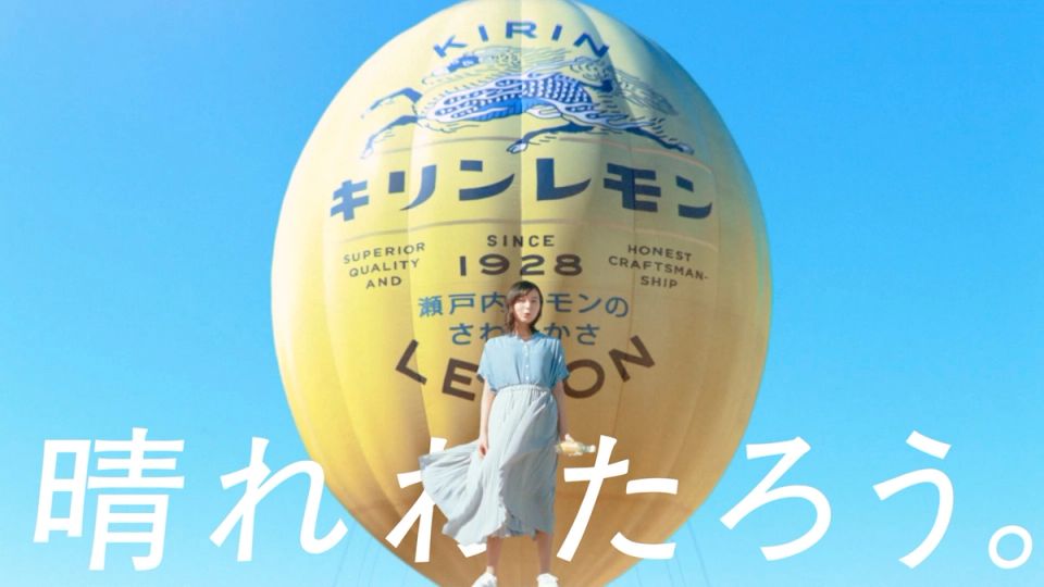
KIRIN LEMON 2021 Advertising
Kirin Beverage -
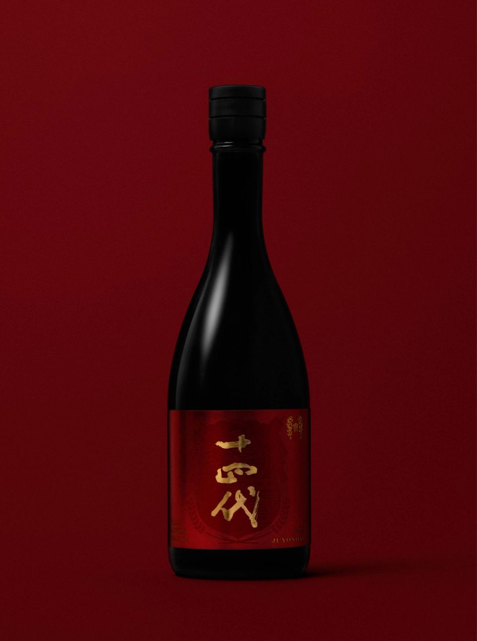
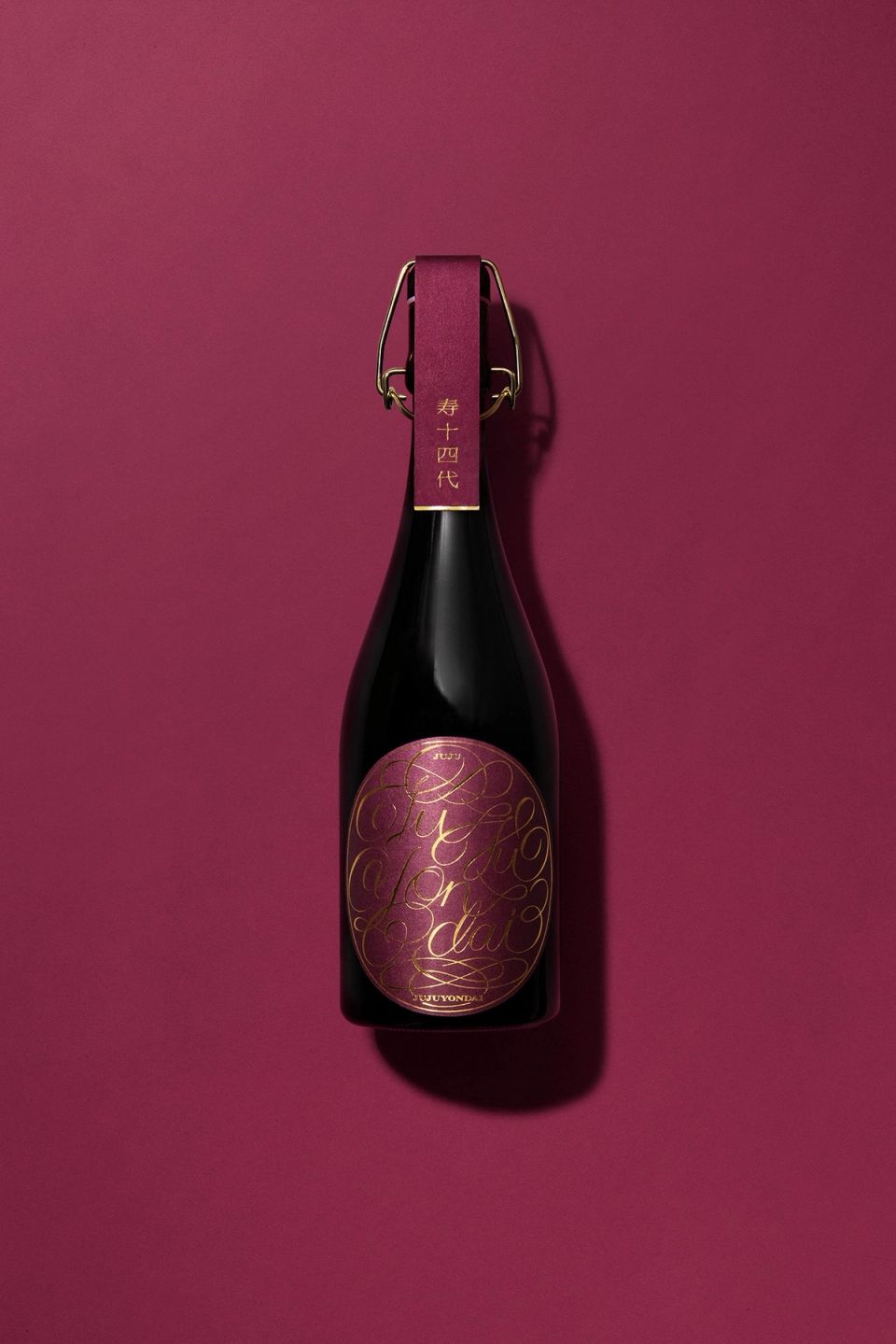
JUYONDAI International
JAPAN CRAFT SAKE COMPANY CO., LTD -
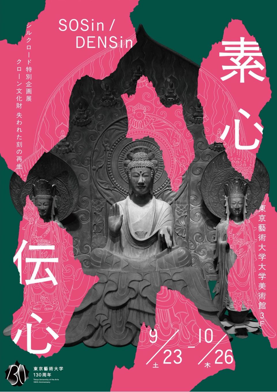
The Grand Exhibition on the Silk Road SOSin-DENSin
Tokyo University of the Arts -
WATER FLOW / G8 Charity Exhibition
Creation Gallery G8 -
Yufuin Sanso WARABINO
Yufuin Sanso WARABINO co.,ltd -
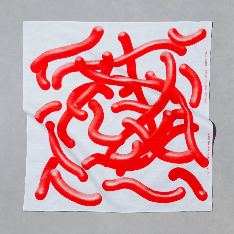
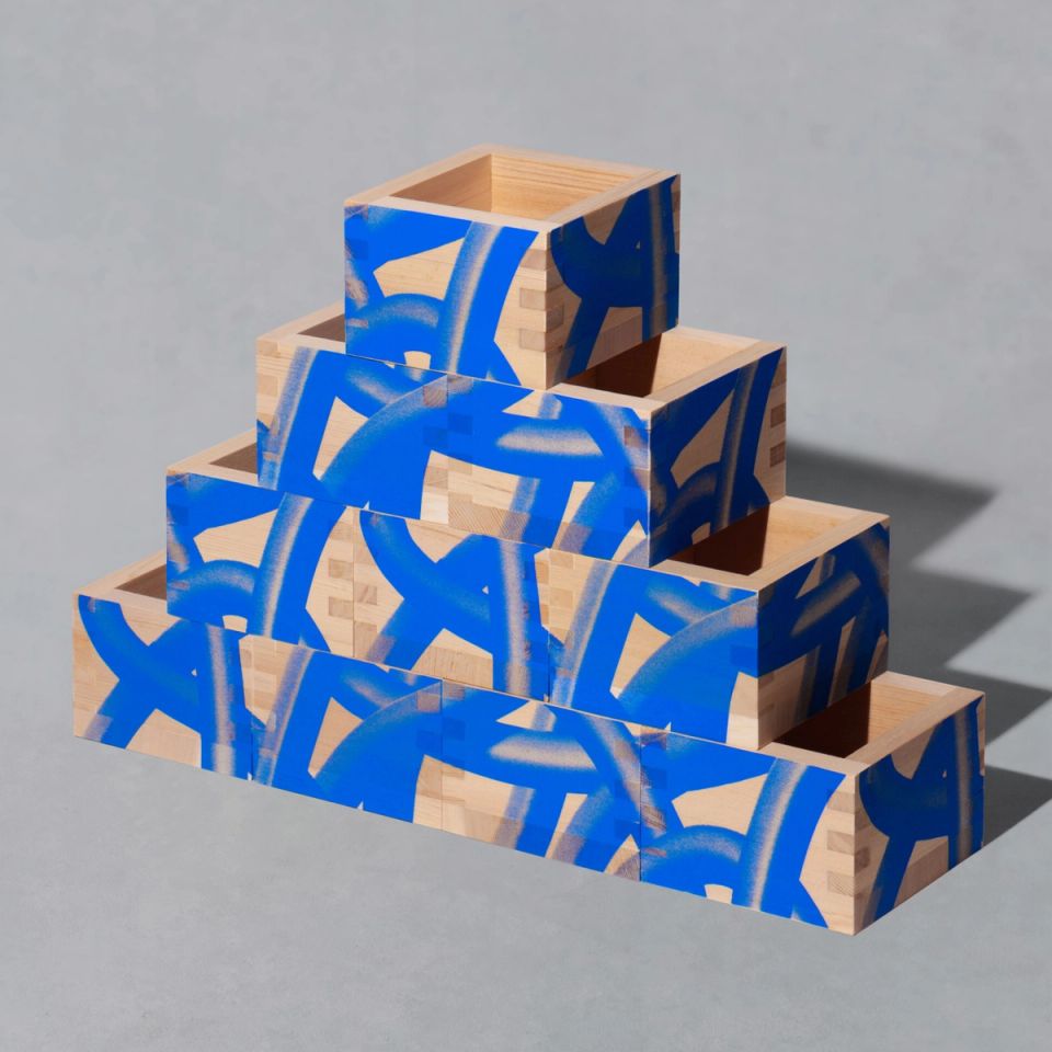
ARABESQUE / G8 Charity Exhibition
Creation Gallery G8 -
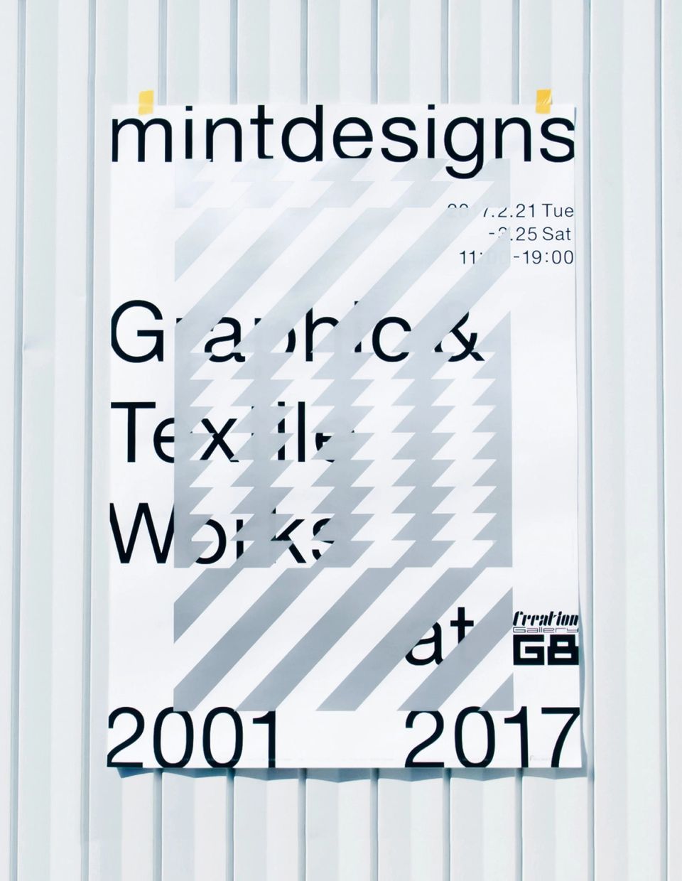
mintdesigns exhibition “graphic & textile works 2001-2017”
mintdesigns -
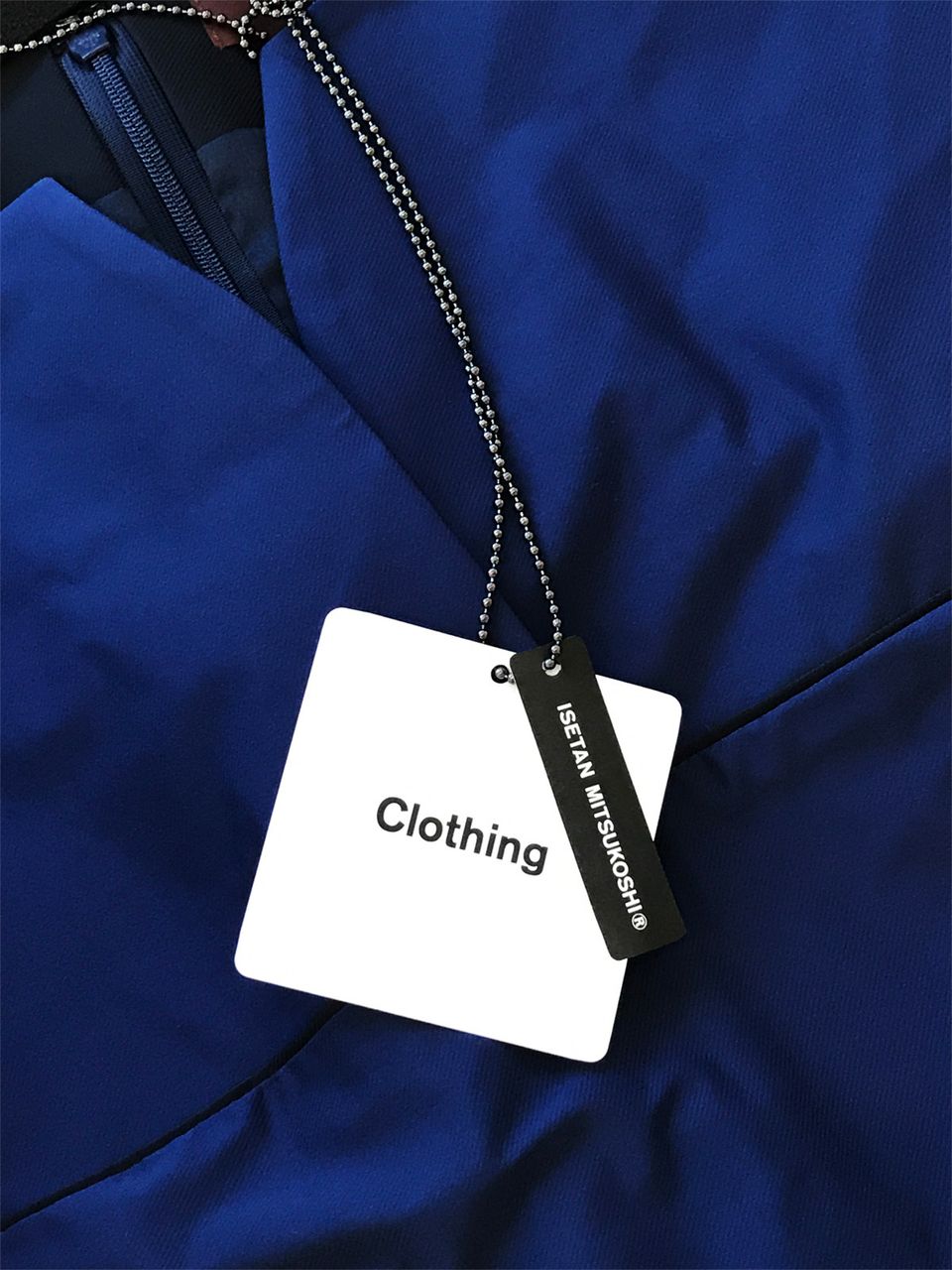
Clothing ISETAN MITSUKOSHI ®
Isetan Mitsukoshi Ltd. -
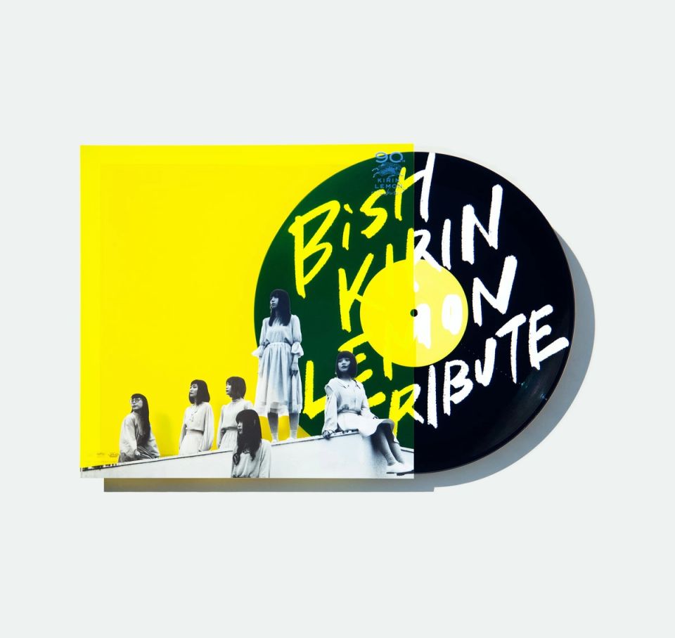
BiSH / 透明なままでゆけ
Kirin beverage -
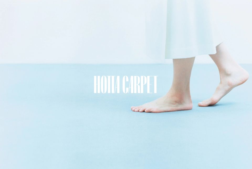
woolflooring
HOTTA CARPET -
Yaoko PB 2021
YAOKO -
KIRIN LEMON 90th Graphic
KIRIN beverage Co.,Ltd. -
DROP
Non Client Work -
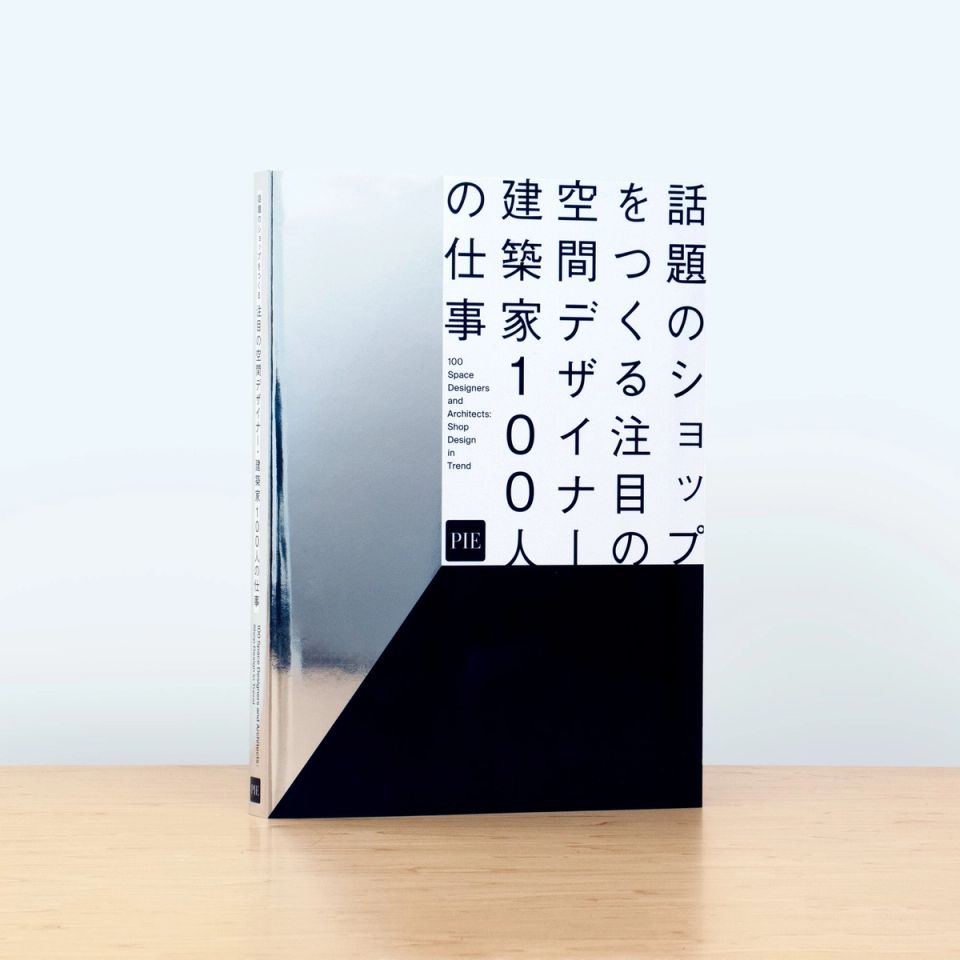
PIE BOOKS “100 Space Designers and Architects”
PIE International -
“LINES” KEITA SUZUKI
PRODUCT DESIGN CENTER -
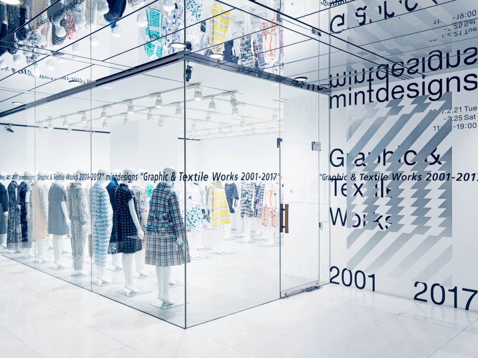
mintdesigns exhibition “graphic & textile works 2001-2017”
Creation Gallery G8 -
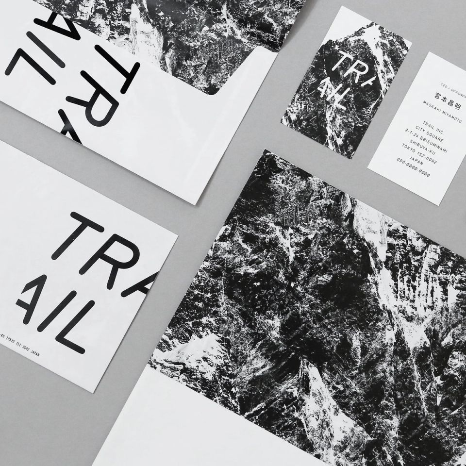
TRAIL tools
TRAIL -
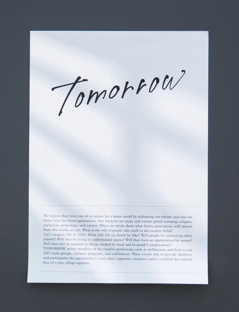
Tomorrow
TOMORROW -
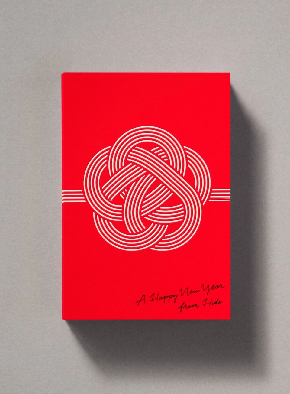
ACCA / New Year Card
ACCA -
JUJUYONDAI 2018
JAPAN CRAFT SAKE COMPANY -
KIRIN LEMON 2023 Graphic
KIRIN beverage -
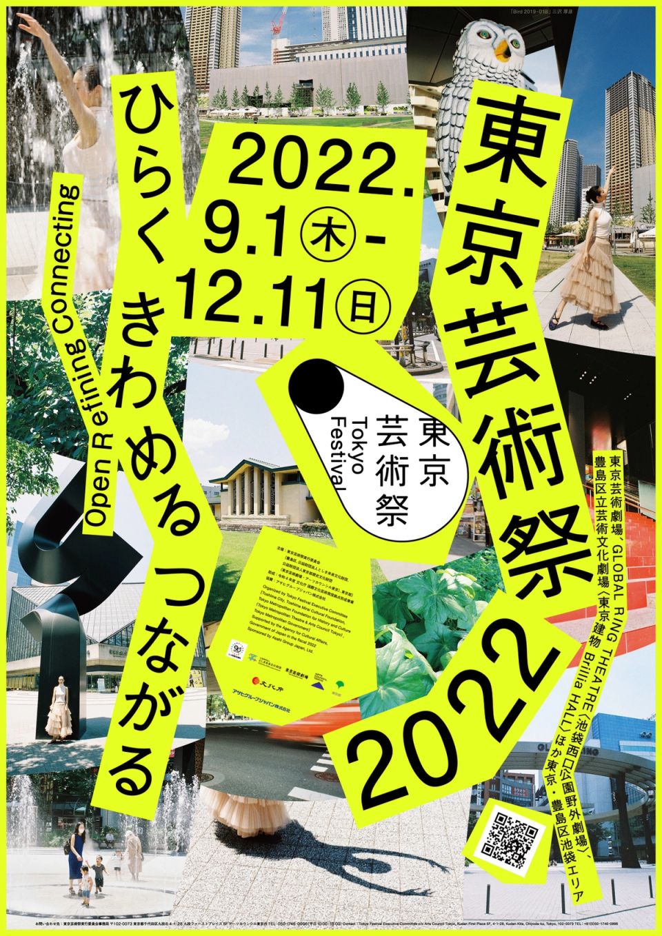
Tokyo Festival 2022
Tokyo Festival Executive Committee -
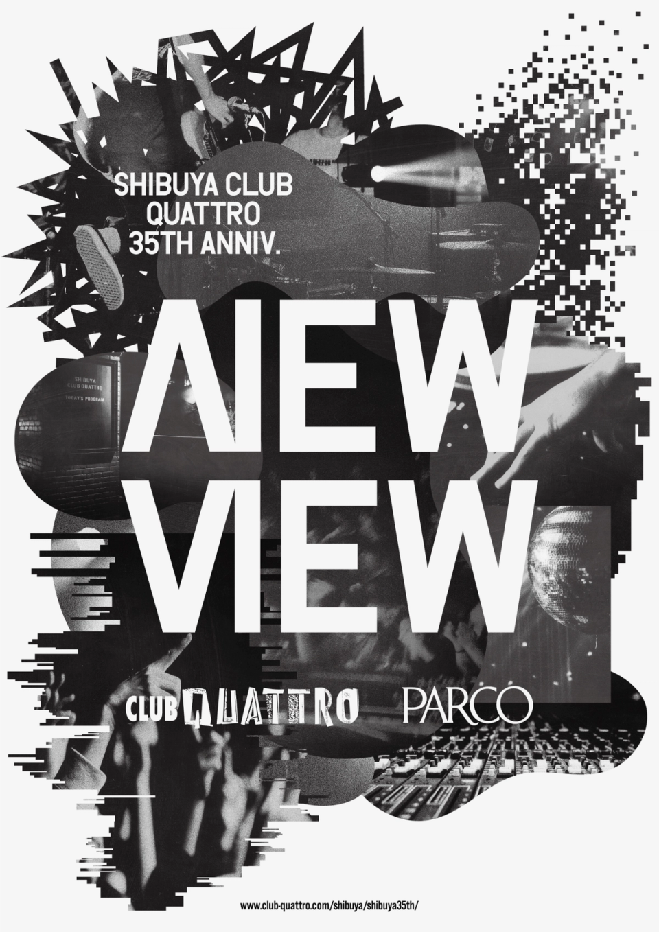
SHIBUYA CLUB QUATTRO 35TH ANIV.
PARCO -
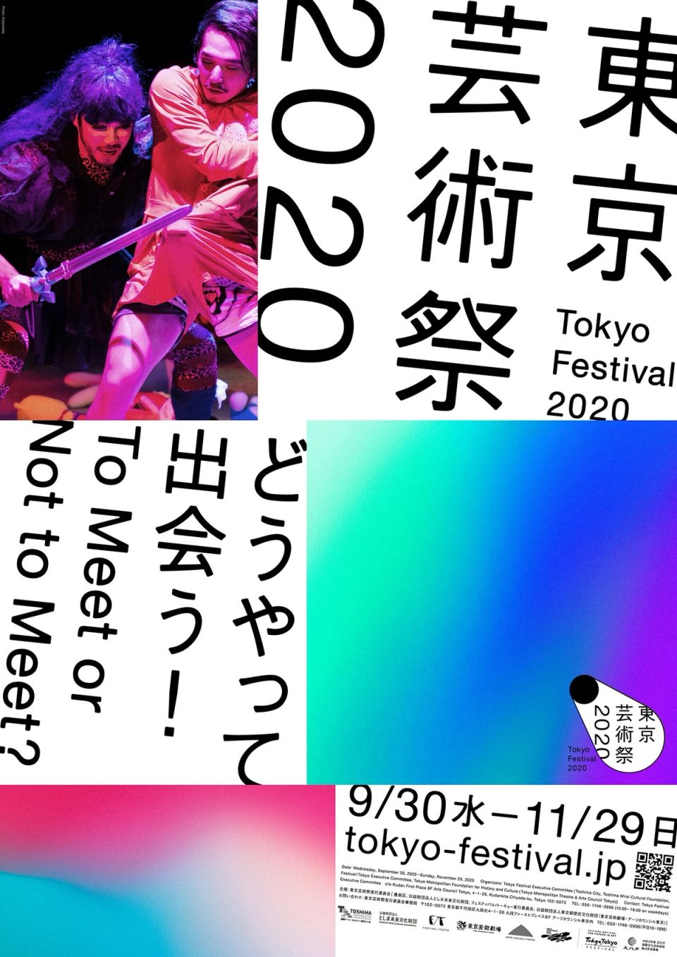
Tokyo Festival 2020
Tokyo Festival Executive Committee -
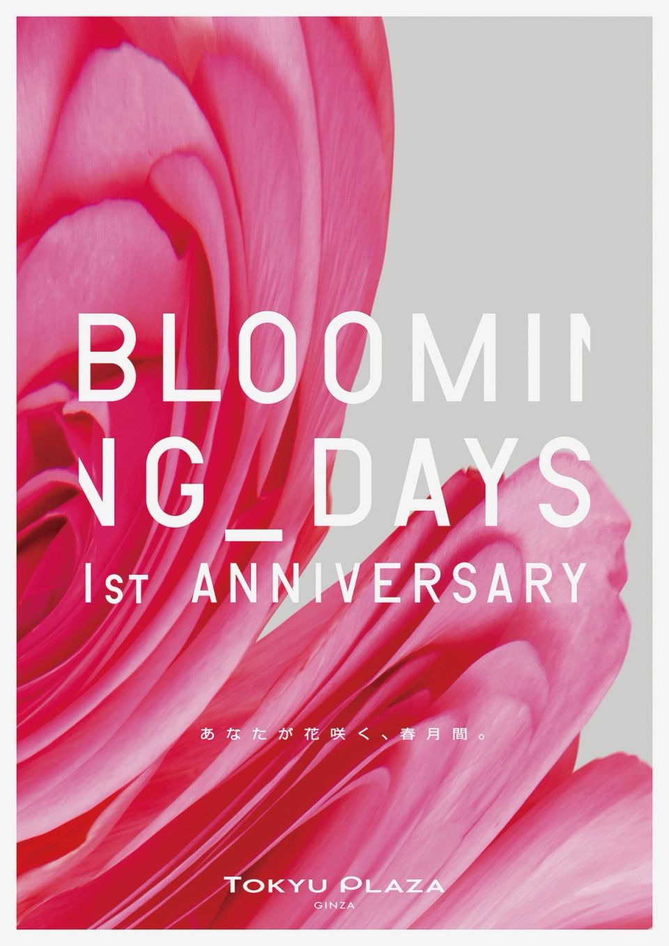
1st ANNIVERSARY “BLOOMING DAYS” and KIRIKO Journal “PLAY FASHION”
TOKYU LAND CORPORATION -
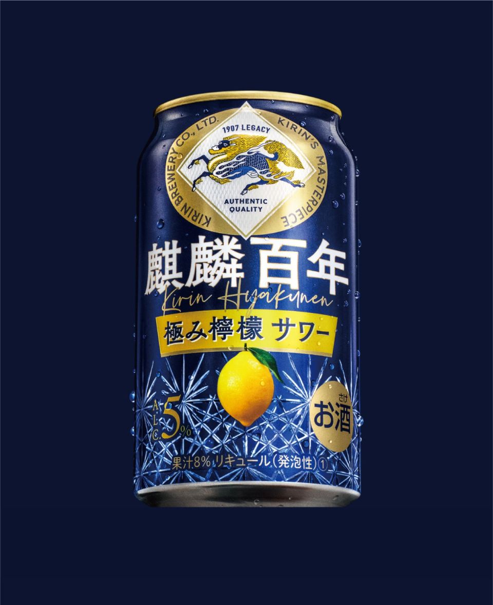
Kirin Hyakunen
Kirin Brewery -
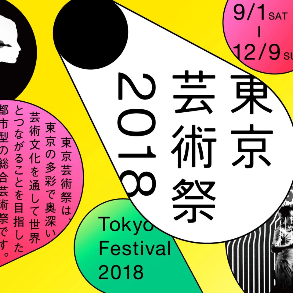
Tokyo Festival 2018
Tokyo Festival Executive Committee -

Iryu 4
Fuji Television Network -
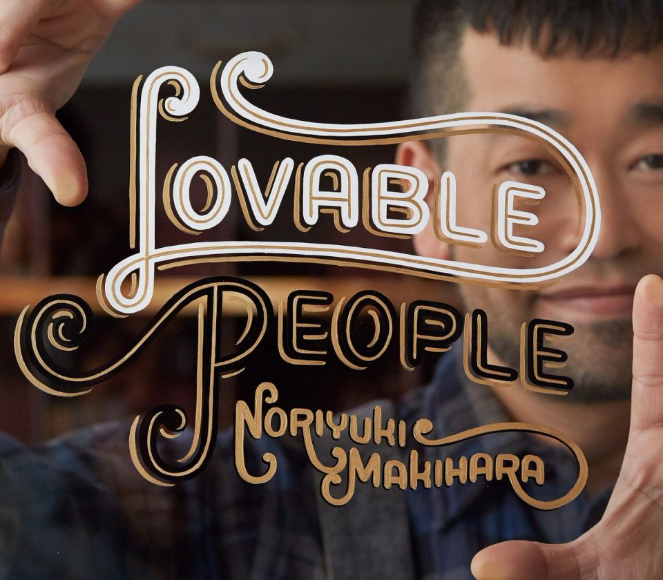
Noriyuki Makihara / Lovable People
WORD & MUSIC -
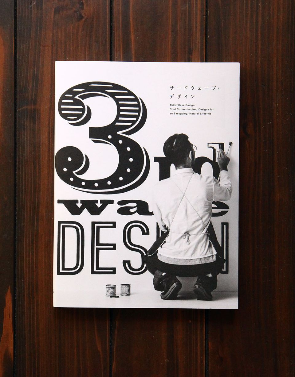
Third Wave Design / PIEBOOKS
PIE International -
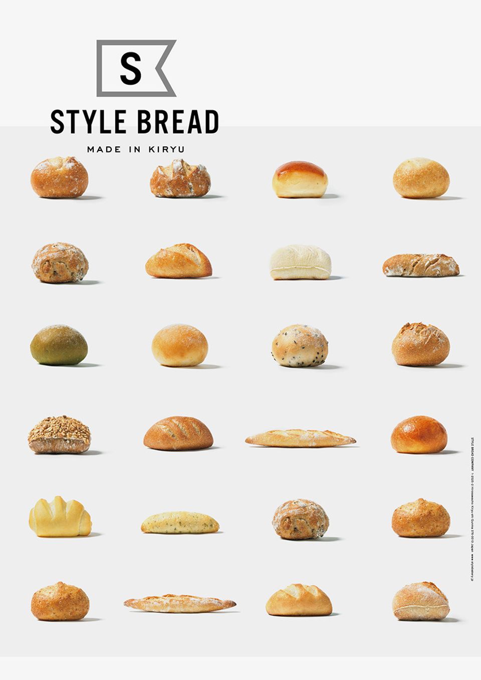
STYLE BREAD C.I.
STYLE BREAD -
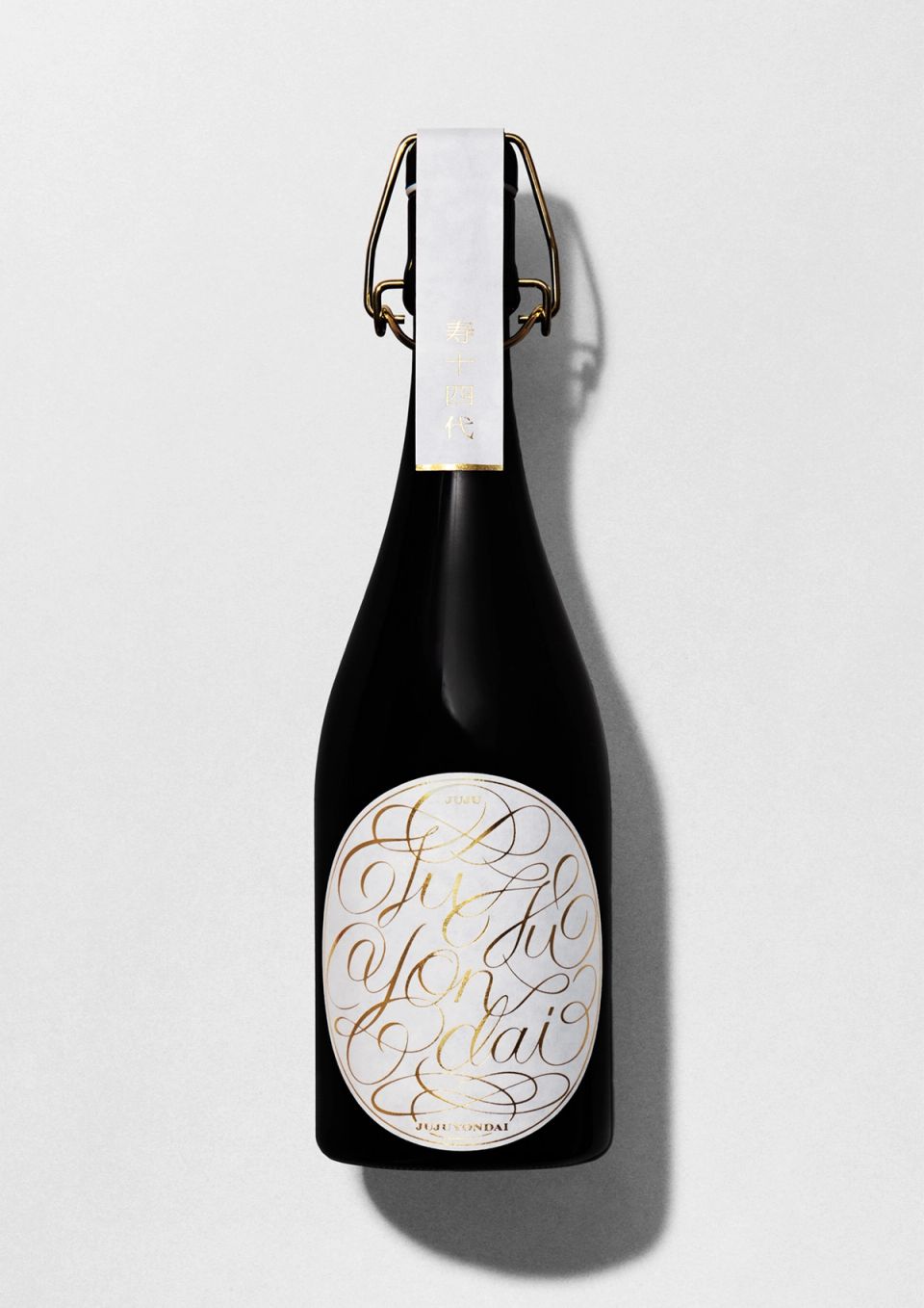
JUJUYONDAI 2019
JAPAN CRAFT SAKE COMPANY -
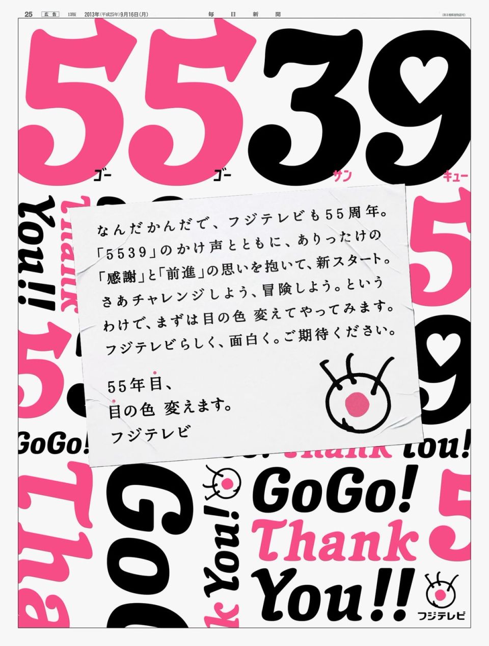
Fuji Television 55th anniversary “5539”
Fuji Television Network, Inc. -
VENT NOUVEAU DIGITAL / water
TAKEO
ブルーゾーンホールディングス C.I.設計 Blue Zones Holdings C.I.


スーパーマーケット「ヤオコー」を中核とする持株会社ブルーゾーンホールディングスのコーポレートアイデンティティ開発を担当。地域の生活を支える事業会社群を束ねる持株会社の設立にあたり、グループの思想を可視化するべくロゴを起点としたC.I.全体の構築を行った。
ブルーゾーンホールディングスは、「地域にお住まいのすべての方が、健康で毎日を楽しめる世界(ブルーゾーン)」の実現をミッションに掲げ、各社の経営管理・戦略立案を担う企業グループである。今回のブランディングでは、長年にわたり地域に根差してきた信頼や実直さを継承しながら、ホールディングス化によって求められる中長期的視点、社会性、そしてグループとしての一体感をいかに表現するかを大きなテーマとした。
デザインコンセプトは、「人・地域・企業がゆるやかにつながり、循環していく姿」。シンボルマークは二つの円弧が重なり合い軌道を描くように構成することで、地域に根ざした事業活動と、それを支え導くホールディングスの役割を象徴している。重なり合う形はグループ各社の連携と成長を示すと同時に、全体で「B」の形を成すことで、「Blue Zones」の頭文字を内包している。
ロゴタイプおよびC.I.全体においては、過度な装飾や主張を避け、生活に寄り添う企業としての静かな佇まいを重視した。視認性と信頼感を表すタイポグラフィと信頼性を表す色彩設計によって日常を支える存在としての信頼感を表現している。本C.I.は単なるロゴ開発にとどまらず、グループの思想を共有し社内外に一貫したメッセージを届けるための基盤となるよう設計した。
We led the development of the brand identity for Blue Zones Holdings, the holding company centered around the Japanese supermarket brand Yaoko.
Established to oversee and guide a group of regionally rooted operating companies, the project focused on creating a visual identity that articulates the group’s philosophy and long-term vision through a cohesive VI system, extending beyond the logo itself.
Blue Zones Holdings is driven by the mission of realizing a society in which everyone in the community can live healthily and enjoy everyday life—a concept inspired by the idea of “Blue Zones,” regions around the world known for longevity and well-being.
As the group transitioned into a holding company structure, a key challenge was how to preserve the trust and sincerity cultivated through decades of local engagement, while clearly expressing a broader, future-oriented corporate presence with social responsibility and group unity.
The core design concept is connection and circulation—the idea that people, communities, and companies are gently linked, supporting one another in a continuous flow.
The symbol mark is composed of two overlapping arcs that trace orbital paths, representing both the locally grounded business operations and the strategic role of the holding company that supports and connects them.
Their intersection signifies collaboration and sustainable growth among group companies, while the overall form subtly shapes the letter “B,” the initial of Blue Zones.
Across the logotype and the wider visual identity system, the design intentionally avoids overt assertiveness or decorative expression.
Instead, emphasis was placed on a calm, restrained presence befitting a company that exists within everyday life.
Carefully balanced typography, generous use of white space, and a subdued color palette convey reliability and dignity—not as a dominant corporate force, but as a trusted presence supporting daily living.
This project goes beyond a logo redesign.
It establishes a shared visual language that communicates the group’s values consistently, serving as a foundation for alignment both internally and externally as Blue Zones Holdings moves forward.
Client: 株式会社ブルーゾーンホールディングス / BLUE ZONES HOLDINGS CO., LTD.